We all know something is awfully wrong with the new Dropbox design, a design Dropbox says it's the biggest change to the Dropbox brand in their 10-year history (might not necessarily be the best).
In this post, I attempt to simplify where Dropbox went wrong and why all the noise you've been hearing is something they should look into.
What is design?In simple terms, design is all about reducing the friction between users and their goals. Design is not only software. There are various design systems around us.
Nowadays, companies employ design to reduce the friction between users and their goals and to convert visitors into recurrent users of their product.
Dropbox's ProblemWe all know what Dropbox is — a storage service. Simple as that.
Another thing that's also simple is that Dropbox is boring and it's not a household name. Storing files is boring. Recovering files is boring. A lot of other apps and products you use actually use Dropbox for storage but we couldn't care less.
Now the problem is that Dropbox is a rich company. Rich companies want to get richer but mere file storage as a service won't cut it. A lot of us use the free tier of Dropbox. To get richer, Dropbox needs to build products that people love to use every day. Something they have tried with both Mailbox and Carousel. Needless to say, both didn't work out so well and Mailbox was shut down on February 26, 2016.
Enter Dropbox Paper. Paper is Dropbox's latest attempt to create an everyday product users will actively interact with. It has received a reasonable amount of love so far and now Dropbox is trying to create a lot of buzz for their new baby.
Dropbox and the basics of designAnother thing has just become clear — Dropbox's redesign is because of Paper.
Their new logo, images, and language overhaul is all because of Paper. Now where's the problem?
1. Branding and identityIt looks like Dropbox is going about their identity and branding well, except that they're not. Their concepts lack empathy, it lacks any personal connection with the users.
At the core of design is people, So it's important to have empathy for the user.
Take their logos for instance, the image below are only the ones they showed on Dropbox.design, I wonder how many more are in their raw "dropbox_logos.ai" file. Great brands are known for their logos in terms of color and uniqueness — Starbucks, for example, is known for their green color while Netflix is known to be red. Dropbox? The jack of all colors, master of none.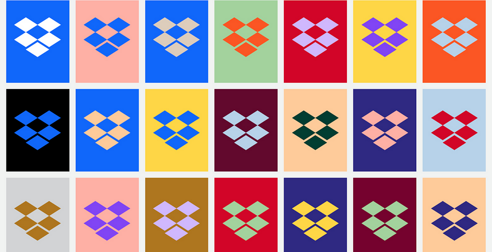 27 variants of one logo. Lost identity
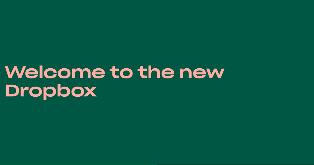 The New Dropbox
To a new or recurring user what does this color mean? What do all the million colors they've combined mean? How do I relate to these? Let me make a quick case of why they should have stuck with Blue as their primary color (if they still have a color system).
Blue is one of the most commonly used colors when coming to product design. Once you see a product that's blue, you're calm and you already feel like you're in familiar territory. The blue color is considered to give emotions such as trust, safe (Dropbox storage) + creativity and calmness (Dropbox Paper).
Sounds like a match made in heaven right? Dropbox didn't think so.
3. TypographyThis is where they totally lost me. Typography is just as sensitive as color.
But they got this all wrong by a wide margin most people sincerely thought there was something wrong with their browsers. 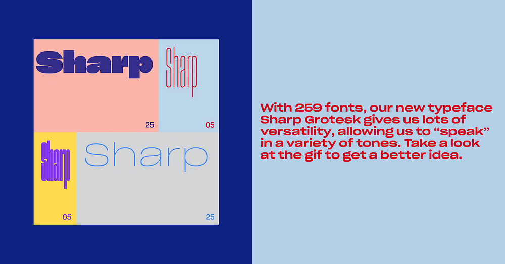 This makes reading so hard. This is a headache
You don't have to "speak in a variety of tones." You don't need to "speak in a variety of tones." Find your voice and be known for that. Create an identity for your brand. Trying to satisfy everyone satisfies no one.
Standalone, nothing is bad. This typeface is not bad but the implementation is horrific. It makes scanning the website impossible, it makes reading a chore. The line-spacing is wrong, and the font looks stretched horizontally sometimes. Other times, it looks stretched vertically. How hard is it to pick a font that works? Scrap that. How hard is it to continue with whatever font you were using already?
4. ConsistencyAs a brand, you want to maintain consistency across your web pages, products and everything else. It makes you organized, sorted and life is easier for your users. They know what they're expecting before they see it and interaction is seamless. Remember when I said design is reducing friction between users and their goals? Sadly, Dropbox doesn't believe in consistent systems. 1. Font consistency is null
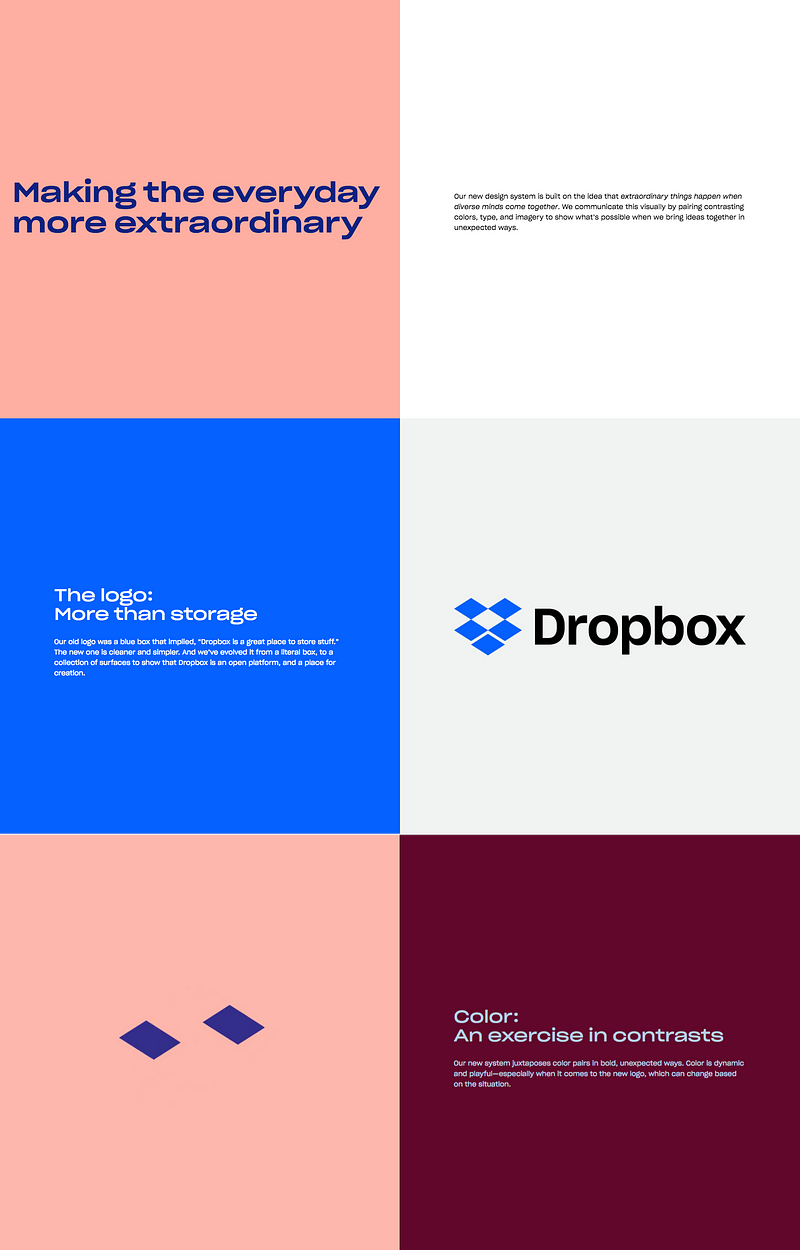 2. Color and content alignment makes each page extra work before you can consume the information
 3. Lack of icon consistency on dropbox.com/paper
Strong visual hierarchy and composition will guide your eyes fluidly across a layout. Poor visual hierarchy will result in miscommunication or confusion. Repetition and rhythm = scanning efficiently.
Source: Dropbox really screwed up its new design
No comments:
Post a Comment