Pages

Wednesday, December 6, 2017

30 web design tools to speed up your workflow in 2018

The right web design tools can streamline your workflow, helping you work smarter – rather than harder – and more efficiently. After all, you want to invest your energy in solving problems, delighting users and creating beautiful designs. You don't want to waste it on dull, repetitive and soul-sapping tasks. 

Thankfully, new web design tools are being released all the time to help you simplify processes, and reduce time and effort – most notably in UI design. 

Here, we look at 18 brilliant web design tools for 2018 that will help you become more productive in the coming year. Some are brand spanking new; others have been around for a while. But all have the potential to save you time, energy and budget in your web design projects.

01. Sketch

Sketch is rapidly replacing Photoshop as the UI design tool of choice

We'll start with the most obvious. Yes, we know everyone's heard of Sketch – Bohemian Coding's vector UI design tool – but anecdotally it seems there are still a lot of web designers relying on Photoshop for UI design (and that's despite the release of Adobe XD, Adobe's shiny new prototyping and wireframing tool – one of the newest additions to Creative Cloud – which comes in second on this list). 

Rory Berry, creative director at Superrb, rightly feels that using Photoshop for web deign is a mistake. He made the switch to Sketch in 2017, and highly recommends it. "Having been a user of Photoshop for over 10 years, it was hard to change and learn something new," he says. "But literally after the first day of using Sketch, there was no looking back. I'm a total convert."

He offers a number of reasons why. "Compared to Photoshop, sorting all your documents that you have and making revisions on Sketch is much easier," he begins. "Sketch has small documents whereas Photoshop has large ones. Due to it being a vector-based app, the file sizes are dramatically smaller compared to Photoshop."

And that's not all. "The built-in grid system in Sketch is great and makes interface design much easier. I think the overall UI and minimal feel makes it much cleaner to design in and user friendly. Photoshop seems very complicated in comparison."

The Sketch community offers hundreds of plugins to make a designers work flow easier and smoother, he adds. "There's basically a plugin for everything if you can find it. Photoshop/ Lightroom is still our go-to for photo editing, but Sketch is all round winner for web design."

02. Adobe XD

Sketch rival Adobe XD has a light interface that allows you to concept and prototype with ease

Adobe now has its own vector design and wireframing tool, Adobe XD. We reviewed the Beta version this May, and it was formally released this October.

XD includes drawing tools, tools that enable you to define non-static interactions, mobile and desktop previews, and sharing tools for giving feedback on designs. It allows you to select a device-specific artboard size for starting a project, and you can even import a popular UI kit, for example Google's Material Design.

Andrei Robu, design director at Robu Studio in Barcelona, is among its fans. "XD doesn't replace Sketch yet, but for quick mock ups it's great," he says. "It's a very light interface, with lots of photos loaded in, and great for moodboards. The prototyping is very useful to show clients how stuff works, especially because you can push the content online right away I also love that I can copy and paste stuff from other Adobe apps."

Crucially, Adobe XD integrates with the rest of Creative Cloud. Ellis Rogers, graphic designer at Receptional Ltd https://www.receptional.com, also recommends it. "Sketch is brilliant for designing for a web developer, because you are working in values in a software built exactly for designing websites and apps," he says. "But the biggest limitation for me was it only being available on Mac, making it difficult to share Sketch files for web developers/designers not using OS X.  Sharing Sketch files for development meant additional software/conversions, or working from flat JPGs – something that caused too many boundaries.

Being a user of Photoshop and Illustrator, the UI for Adobe XD felt familiar, he adds so there wasn't a real learning curve for using it. "So now after a few weeks of trialling, it's the only tool I now use for all web design, app design, prototyping or wireframes." 

Rogers also praises the ability XD offers to use Adobe libraries to quickly import any asset from Photoshop or Illustrator, as this makes collaboration projects run more quickly. 

"Working with UI/UX designers and illustrators makes this process simple," he says. "When the design/prototype or wireframe is complete, Adobe XD allows you to very quickly select elements and create page transitions for a working prototype, which can be shared via a link. The link also allows you to gather feedback per page, keeping it all organised. The link can be updated within Adobe XD so the client can always see the latest version without having to worry about incorrect versions; an absolute joy to work with."

Learn how to prototype a mobile app with Adobe XD. 

03. Figma

Figma allows you to design, prototype and gather feedback with other designers in real time

Figma is an interface design tool that enables multiple designers to collaborate in real-time. It's available in the browser, or on Windows, Mac or Linux, and there are both free and paid versions depending on what you use it for.

Here are some of its outstanding features:

"Figma has a similar USP as Sketch with the exception of being cross platform," explains frontend designer Benjamin Read. "I recently used it to create a couple of icons for an article we're publishing on our website and found the workflow incredibly smooth. It took me no time to learn and had the added benefit of being collaborative: you can share graphics with others within the app."

"I've been trying to switch to Linux for my work and sometimes we use Windows, so Figma makes sense to me from a practical standpoint," he adds. "In comparison I've found many tools for other platforms fall short."

Content writer and artworker David Eastwood, who works for Co-o Electrical, also has good things to say about Figma. "We were recommended Figma by our web development agency and use it for landing page wireframes," he explains. "This has included proposed changes to the homepage and specific sales landing page, especially around Black Friday. It's also been a really useful tool when we've needed to quickly mock MVTs; sometimes small additions to an existing layout. We love that you can quickly create designs for desktop, tablet and mobile."

Learn how to create a responsive dashboard with Figma.

04. Affinity Designer

Serif's Affinity software is rapidly becoming the alternative to Creative Suite

"Serif's Affinity Designer has been dubbed the 'Photoshop killer' by some, and it's easy to see why," says Dan Edwards, creative director at No Divide. "My first impressions are that the app is incredibly well designed and feels like it's been made to be a dedicated web and graphic design tool."

"There were a few features  I really enjoyed, including adjustable, nondestructive layers. This essentially means you can adjust images or vectors without damaging them."

"The 1,000,000 per cent zoom was just bliss (very often Photoshop's 32,000 feels like it's just not enough). This is especially useful when working with vector art, as you can really get in close. The undo and history features are also really handy – Affinity allows you to go back over 8,000 steps!"

"When it comes to designing, the UI feels familiar. When moving from Photoshop, everyone seems to want to start over, which can pose a real challenge. What Affinity has done is to keep the layout familiar, while tightening everything up and hiding distractions. I was easily able to jump straight in and get designing."

"Overall, Affinity feels like it could be a real competitor to Photoshop, Illustrator and Sketch. And at just £48.99 it's a real bargain!"

05. Anime

Spice up your apps with this animation engine

Although web page animations have at times got a bad rap, developers are always looking for ways to make things easier. CSS animations and transitions have been a huge step forward, but more complex interactions often require a library. Anime is a new animation engine you'll want to take a look at if you need to add complex animated components to your apps.

Here's an example to demonstrate the super-simple API:

This code defines the objects you want to animate, along with specifics of the animations. The API allows you to target elements using CSS selectors, DOM elements or even JavaScript objects.

The author, Julian Garnier, has provided a CodePen collection that demonstrates what the library can do, as well as thorough documentation on GitHub.

06. Avocode

Avocode helps you code websites or apps from Photoshop or Sketch designs

Avocode makes it extremely easy for frontend developers to code websites or apps from Photoshop or Sketch designs. It's built by the same team that brought us CSS Hat and PNG Hat, so it's not surprising they've taken the exporting process one step further here. Although previous apps have allowed you to export assets, what makes Avocode really special is that you can use its Photoshop plugin to sync your PSD into Avocode with just one click.

Avocode quickly and automatically analyses your PSD or Sketch file and brings everything into a beautifully designed UI. You then have full control over how you export assets, including SVG exporting as standard.

You can also click elements in the design, and copy and paste the code into a text editor of your choice. "It gives users everything they need for coding – a preview of the design, and access to all layers and export assets," says Avocode co-founder Vu Hoang Anh. "The best thing is that developers won't need Photoshop or Sketch at all. The current workflow really sucks and that's why we created Avocode."

Overall, I'm not 100 per cent sure any app can ever replicate a developer. However, I'd happily use this to turn PSDs and Sketch files into interactive designs that could form the foundations for the website build.

07. Zeplin

Zeplin translates Photoshop or Sketch files into a free Mac, Windows or web-based app

Do you find handing over design assets to developers can be a bit of a hassle? James Stiff certainly does. "They don't always share the same software," he points out, "so those painstakingly layered and annotated Photoshop mockups end up as flattened files and things inevitably get lost in translation." 

Zeplin mitigates this painful experience by translating Photoshop or Sketch files into a free Mac, Windows or web-based app. "The best part is that Zeplin provides quick reference for the colours, dimensions and fonts from your designs," says Sitff. "It even generates CSS and style guides. I've found Zeplin to be a massive time saver and my developer friends seem to really like it too."

08. Pattern Lab
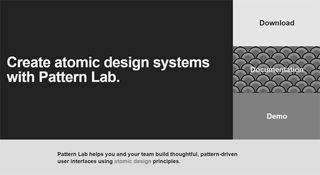
Pattern Lab is based around Atomic Design

Pattern Lab is a beautiful pattern-driven design tool created by Dave OIsen and Brad Frost. It's based on the concept of Atomic Design, which says that you should break your design down into its smallest parts – atoms – and combine them to form bigger, reusable components – molecules and organisms – that can then be turned into usable templates.

Although at its core it's a static site generator that stitches together UI components, there's much more to Pattern Lab than that. It's language- and tool-agnostic; it enables you to nest UI patterns inside each other and design with dynamic data; it features device-agnostic viewport resizing tools to help you ensure your design system is fully responsive; and it's fully extensible so you can be sure it'll expand to meet your needs.

09. Vivaldi

Sometimes the best tool can be something as simple as a new browser. Vivaldi is a fast, customisable web browser for power-users built by some of the people who started Opera. Dubbed 'a browser for our friends', Vivaldi is built using web technologies: JavaScript and React were used to make the user interface, along with Node.js and lots of NPM modules. 

Vivaldi is the most customisable browser out there, and it offers other cool features such as command line control, a panel for taking notes, tab stacking and tiling, and web panels that enable you to put all your favourite sites in one place for easy access.

10. Canva

Canva is a popular tool for quickly creating social media images and infographics

Want to mock up something like an infographic quickly and easy? Then Lawrence Harmer, founder of Solve Web Media, recommends Canva.  It's a free, browser-based tools that's used by both designers and non-designers, to make graphics for both print and the web. 

"Canva is pretty good for making nice images," says Harmer. "Images are the window into the soul of your website and social media, so a tool like this can be key to success." 

11. Web design proposal tool

Generate web design proposals easily with this free tool

Beewits has a nice line in tools to make the business side of web design easier, namely its the Web Design Quotation Generator and Hourly Rate Calculator. Now for 2018, they've brought out another superb free app: the self-explanatory Web Design Proposal Tool. 

"It's essentially a simple 'Proposify' tool, which allows you to quickly and easily churn out proposals," explains Beewits' David Attard. "It's essentially a glorified form that allows you to enter and change pre-set text, and then creates a Word document ready for sending directly to the client."

If you sign in to the free service, you can Save your current version, such that next time round, you've got a bunch of fields already filled in with your details. It's simple, but it gets the job done, and what more do you really want? It's not officially been launched yet, as Beewits are currently canvassing feedback, but it's otherwise ready to use.

12. Site Stacks 

Check out any website's tech stack quickly and easily

Here's another browser-based tool that's both simple and brilliant. Type in the URL of any website to this Chrome extension and it lets you look at its tech stack. It's fast, smooth and reliable, provides coverage for over 40,000 products and prides itself on both the accuracy and exhaustiveness of its data. 

"We built this extension to be a simpler way to access this data," says its makers, "while also protecting your privacy and running all operations on our own servers so that your browsing isn't slowed down."

13. CodePen Projects 

A new tool lets you build websites directly inside CodePen

Founded in 2012 by Alex Vazquez, Tim Sabat and Chris Coyier, CodePen has grown to become of the web's largest and liveliest communities for testing and showcasing HTML, CSS and JavaScript code snippets. For the last five years, it's functioned as both an online code editor and an open-source learning environment, where developers can create code snippets ("pens"), test them and get feedback. 

Recently CodePen took another big leap forward by launching its own IDE (Integrated Development Environment), CodePen Projects, which lets you build websites within your browser. 

You can drag and drop your website files, organise them into tabs, and preview your site as you build it. There are templates to help you create sites more quickly if you choose, as well as built-in debugging tools. 

Note that, although it works in a similar way to the Pen Editor, CodePen Projects doesn't replace the lattter but sits alongside it. You can learn more about CodePen Projects in this blog post.

14. Bootstrap

Old favourite Bootstrap has some powerful new updates

Bootstrap is certainly not a new tool. But the new version of the world's most popular frontend framework is tabbed as 'a major rewrite of almost the entire project' , so I think it warrants a mention. Some notable changes include the following:

Bootstrap has revolutionised development and there's no doubt the ubiquitous framework will continue to shape how we build stuff on the web.

15. ally.js

Don't overlook accessibility - use ally.js

No list of web development tools would be complete without at least one accessibility tool. Accessibility is one of those often-neglected aspects of design and development, and ally.js can simplify it for you.

Now a stable product, ally.js is a JS library that gives you fine control over focusable and non-focusable elements. For example, using its API you can prevent elements outside a modal window from receiving focus until the modal is closed. You can also find out exactly which elements are focusable or tabbable, and identify focus changes within the shadow DOM.

Two other powerful features are the ability to determine in what manner focus has changed (keyboard, mouse, etc.) and when an element is focusable and physically visible on the screen (this can help to avoid page scroll).

16. Type Nugget

Type Nugget gives you greater control over your typesets 

Type Nugget addresses a need you'll have on just about every frontend project: dealing with CSS typography. Still in beta with more features in the works, it's an online typesetting tool that gives you fine control of type styles. 

The tool displays a diverse set of text samples on the page, which can be live-tweaked in a panel on the right. The panel lets you select font size, weight, style, colour, letter spacing, text decoration and more for individual aspects of the page (global styles, headings, paragraphs, links and HTML lists).

Usefully, this tool allows you to register for an account, log in and save your progress. After specifying all your settings, you can hit the 'Generate Code' button and Type Nugget will produce a link to a style sheet hosted on its CDN. If you find CSS typography tedious and repetitive, you'll benefit greatly from adding this tool to your workflow.

17. ARKit 

Create augmented reality experiences for iOS 11 devices with Apple's ARKit

Augmented reality – blending digital objects and information with the environment around you - is a space that's generating a lot of excitement in the web and app development community right now. Not least because in June at WWDC17, Apple released ARKit, a new framework that allows you to easily create AR experiences for iPhone and iPad running iOS 11. To get started, simply download iOS 11 and the latest version of Xcode 9, which includes the iOS 11 SDK. Check out what ARKit is capable of.   

18. Vue.js

Not used to complex JavaScript libraries? Vue.js is perfect for you

What would a list of new web tools be without the hottest new JavaScript framework? Vue.js, like React, is a framework for building user interfaces, and utilises a virtual DOM. As the name suggests, Vue's core library is focused on the view layer.

Look at a code example, taken from Vue's docs, that utilises user input and demonstrates the library's elegance. We'll start with the HTML:

Notice the custom v-on handler that calls the reverseMessage method. Here's the JavaScript:

In that example, I'm populating the paragraph with data and defining the reverseMessage method. Vue is great for those less experienced with complex libraries, but also has a number of plugins to help with development of complex single-page web apps.

19. Hologram 

This Mac app built on A-Frame lets you create WebVR experiences without needing to code

Hologram is a new all-in-one tool for WebVR creation. This free desktop app requires no previous coding knowledge, and its native Google Blocks integration enables you to play with lots of free 3D objects right off the bat. Under the hood, Hologram takes full advantage of the power and simplicity of A-Frame, Mozila's WebVR framework. 

This means that developers can download projects created with Hologram and use them in their A-Frame workflows. It's currently available on Mac and a Windows version is promised soon. 

20. Parallax SVG Animation Tools

This set of tools makes it easier to create complex sequences of SVG animation 

Created by Gareth Battensby of Parallax, SVG Animation Tools is a range of SVG animation tools in the form of a Python script. "I built the tools as a response to the frustrations you get when creating complex or long sequence SVG animations," he says in this explanatory blog post. 

"The biggest of these being overwritten edits whenever you re-export from Illustrator. These tools completely eliminate that issue – they're perfect for front-end developers who animate SVG graphics with GSAP or similar animation libraries."

21. GitHub Notifier 

Get GithHub notifications in your browser with this Chrome add-on

Hate wading through emails? Prefer the idea of getting GitHub notifications in your browser? This Chrome extension does exactly that. 

This straightforward but effective tool was created by Stacy Goh and released this September. It enables to get real-time push notifications whenever someone creates an issue, comments on an issue, pushes code, creates a pull request, forks your repository or stars your repository. You can learn more about how and why Goh created it in this blog post.

22. Quill

Quill is a flexible rich text editor with a powerful API

Quill is billed as a WYSIWYG rich text editor 'for the modern web'. There are lots of different contexts in applications where a rich text editor is needed, so it's no wonder Quill has exploded in popularity since its version 1.0 beta release in mid-2016.

Now a stable product, Quill lets you convert a basic div element into a powerful rich text editor with a few lines of JavaScript:

But the most powerful features in Quill are its flexibility and extensibility by means of modules and a powerful API. Quill offers themes and modules that include toolbar, keyboard, clipboard and history. You can test-drive many of these features in the Quill playground and of course the documentation is a must-read if you intend to use its advanced features.

23. URL to PDF 

Convert HTML into PDFs automatically with this API

Brought to you by Alvar Carto, this self-hosted API enables you to convert the HTML into PDFs, so it's handy for rendering receipts, invoices, or any other HTML content. The API ignores a page's @media print CSS rules by default, and sets Chrome to emulate @media screen, to make the default PDF look more like the actual site. You can set it to operate automatically at regular intervals and best of all, it's free.

24. iotaCSS
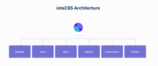
iotaCSS is a CSS framework with a difference

iotaCSS is a CSS framework that's been purposely crafted to be design-agnostic. It was created by consultant frontend architect Dimitris Psaropoulos, who found that other CSS frameworks were imposing a lot of limitations on the designers he worked with. This was forcing him to either write a lot of code on top, or ask the designer to compromise. So instead, he created his own framework, which works a little differently. 

While most CSS Frameworks behave as a unit, iotaCSS is a set of individual, small and flexible modules that don't depend on each other. You can use one independently or you can combine them to build more complicated user interfaces. 

iotaCSS been quietly in development for a couple of years, with a number of early adopters using it to build high-scale products. But now it's out of beta and confidently announcing itself to the world. You can learn more about how it works in this blog post.

25. Launchpad 

Launchpad turns Sketch into a fully fledged website builder

Launchpad is a tool from Anima that lets you publish websites directly from Sketch, with no coding required. 

The entire interface is integrated into Sketch, and can be used to create landing pages and static websites, although at the moment it doesn't support dynamic web pages using JavaScript. But it does let you include links, add responsive breakpoints, set up forms, embed videos and integrate analytics tools. So it could be an ideal tool for setting up a quick and easy promotional website, for example. 

You can learn more about Launchpad in this blog post.

26. React Sketch.app

Airbnb is sharing its bespoke tool with the open source community

React Sketch.app provides a super-easy way to manage Sketch assets in a large design system. Built by the team at Airbnb to help bridge the gap between designers and engineers, it's basically an open-source library that allows you to write React components that render to Sketch documents. 

Because React Sketch.app uses Flexbox, its components can have the same rich layout as your real components. That means no more dragging rectangles by hand; everything works like your target layout engine. 

React Sketch.app, then, makes it simple to fetch and incorporate data into your Sketch files. It also provides an easy way to build your own custom design tools on top of Sketch. You can learn more about how it works in this post.

27. SVGito

This free app saves you having to manually edit SVG files

SVGito is a free web app that cleans up your SVG files, to save you the bother of manually editing them. 

Created by Peter Nowell, this neat little app automatically optimises your SVGs at the touch of a button, and will typically reduce their size and complexity without changing what they actually look like on screen. 

You can learn more about SVGito in this blog post.

28. Sizzy 
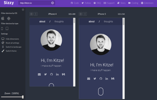
Sizzy allows you to preview multiple screens during app testing

Sizzy is a tool that allows you to preview multiple screens at once while you're testing out your responsive web apps.  

Creator Kristijan Ristovski had previously been using react-storybook to switch between the different variations of each component. But he got annoyed having to go back and forth between so many devices. So he built Sizzy, which allows you to see all the changes simultaneously, making it much quicker and easier to spot and fix layout bugs. 

You can learn more about Sizzy in this blog post. 

29. Foundation for Emails 2

Create responsive HTML emails with Foundation for Emails 2

Foundation for Emails is a framework from ZURB formerly known as Ink. It is used for creating responsive HTML emails that work on just about every platform and service, bundling together email coding best practices. The latest iteration uses a Sass codebase that gives you access to a settings file, wherein you can define all sorts of defaults to suit your needs.

As well as the framework itself, ZURB has provided the ZURB Email Stack, an all-in-one workflow that includes:

The Getting Started guide will help walk you through how to get the stack up and running should you choose to take advantage of all the features.

30. Form
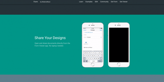
With Form, RelativeWave has taken a novel approach

RelativeWave's Form is a prototyping tool like no other I've tried. It's not a typical design tool in that there's no tools or layers palette. Using the app feels like a mix of design and code.

While you can't actually create graphics in the app, you can insert them and use what Form calls 'patches' to add gestures and interactions. The Mac app requires you to also use the iOS app so you can view your prototype in real time and interact with it.

"Form is an app design and prototyping tool with the goal of producing designs that are closer to what you get in production," explains RelativeWave creative coder Max Weisel. "We want designers to work directly on the production side of an app, and at the same time free up engineers to focus on more complex problems."

There are some great tutorials on how to use Form, but the process is rather complex if, like me, you are used to creating visuals in Photoshop. Moving an image to the centre of your device, for example, is achieved using Superview variables and Match Patches. Once in place you use maths to divide the width and height and connect them to the X and Y positions in Image View. Group those together, rename the variables and adjust the X and Y anchor points. I found this process fairly complex.

However, once you get your head around the processes, you can create stunning prototypes. Having access to the device's camera and other sensors means the prototypes you create are just as powerful as the coded app would be.

Related articles:


Source: 30 web design tools to speed up your workflow in 2018

Monday, December 4, 2017

Ultimate UX Design Guide to SaaS On-Boarding, Part 4: First Login

This is the 4th part of The Ultimate UX Design Guide to SaaS Customer On-Boarding.

SaaS Customer On-boarding is the process that users have to experience while initiating their journey on a company's software application. Customer on-boarding initiates from the experience that employees previously had to undergo while joining a firm. The on-boarding process sets the tone for a good user experience.

Long story short, special emphasis should be given to making the on-boarding process as flawless as possible.

The SaaS customer on-boarding process is based on 6 comprehensive aspects, the first three of which we've already covered:

  • Sign up Form
  • Welcome Email
  • Drip Campaigns
  • First Login & Product Tutorial
  • Data Import & Notifications
  • Check up calls & Swag
  • All the aspects of the process play an equally important part in forming a desirable reputation of the brand in the eyes of the customers during the on-boarding process.

    Today we will be focusing on First Login & Product Tutorial.


    First Login

    I cannot stress the importance of crafting a first login experience to delight your customer enough. The first login experience is where you should be looking if you want your churn rate to go down.

    Rules of Thumb:
  • Do not present your user with a UI that is empty. You need to keep that in mind because with a SaaS product that is B2B oriented, the user isn't going to have everything in front of him from the beginning. Services requiring extant data to function will need that step to be performed after first login.
  • Give clear directions to users for what they should be doing first. They are completely new to the interface so they would need a nod in the direction of the first step.
  • They have gotten to this point—it would be great to thank them again and tell them of how cool it's going to be, once they have set up everything.
  • The first log-in screen at Mention is a great example of this. The dashboard is not empty, there are immediate options with simple captions that you can explore and there's a very clear CTA at the end, which directs you to create your first alert.


    Product Tutorial

    An initial tutorial can be a great way to start building a rapport with your customer, now that you've gotten your first login. Depending on how you design your tutorial, you can quickly familiarise them with the interface of your app so that they can get down to using it.

    Rules of Thumb:
  • Users have to be able to skip it. Going through a tutorial that cannot be skipped can really turnoff your user. If they don't want to see it just yet, they should have the choice of opting out.
  • It should always be something that users can revisit. It is very common to skip any pop up or notification upon logging in for the first time; users just want to start getting their hands dirty. Just ensure that it can be easily located.
  • These are some guiding principles that you should keep in mind when designing your first log-in page and product tutorial(s).

    Making the Experience an Improvement

    A famous programmer called Kathy Sierra says that the app should be able to make its users amazing at something within the initial five minutes of using that app. Ultimately the user should be taking an action that causes a result relevant to your business. Try to generate an experience that would be bound to bring the user back.

    User Communication

    You want to establish a relationship with the user that is of mutual benefit to both of you. That happens when you begin to communicate with them frequently and that too in the initial stages. The product tutorial is one of the easiest ways to establish that channel of communication. Ideally a product tutorial should accomplish:

  • Basic Guidance on how to use the software
  • Allow the user to do something really cool
  • Do this within as limited a time frame as 1-2 minutes
  • One of the best examples of this is Canva.

    1. The sign up is simplicity itself. You can create an account by just giving your email address or use a social media sign in (Recall our discussion on Sign Up Flows)

    2. Decide what you want to start doing. There's a general orientation that you can select at the beginning that will affect the images in Canva's database that you will get to see initially.

    3. The guide starts. How long will it take? 23 seconds. As soon as you click "Show me how it's done", a tutorial will guide you through the simple drag and drop process of selecting an image and modifying it. As mentioned above, the defaults are "intelligent" ones. A graphic is created for you and then you're invited to give it a try.

    4. The interface is colourful, engaging and very easy to use. You're immediately looking at the Beginner's Challenge, which attracts the user even more.

    5. Finally, you get to do something fun, like selecting a hat that you drag onto a monkey's head! The whole process takes under a minute, and you've already mastered the basics of using Canva.

    Within 23 seconds, Canva manages to capture the attention of its users. The interface is intuitive. The tutorial is simplicity itself as it shows the process of dragging and dropping images from its database, adding the relevant headings and downloading the image. It then gets the user to do the same. It's light hearted as well as it gets you to put a hat on a monkey!


    Analytics

    You can analyse the effectiveness of your first sign in and product tutorial. The sign in and product tutorial can be grouped into an experience called the first run experience. The series of steps that need to be taken can be defined and then you can do something called funnel analytics to evaluate the effectiveness of the experience. Tools I would recommend in order to build and measure your funnel are Mixpanel or Amplitude. The idea of funnel is that many users enter the beginning of the user experience and a few come out at the end.

    Measure user progress through the experience by observing the completion rates for each step.

    So usually, you'll get rates of completion that look something like this:

  • Step 1: 1,773 people
  • Step 2: 1,701 people
  • Step 3: 1,399 people
  • Step 4: 1,211 people
  • Step 5: 1,152 people
  • Now it's between Step 2 and 3 that a lot of people opted out of the user experience, which indicates that that's the area where you should focus.

    In this way you can refine your first login experience so that it retains the most users.


    Source: Ultimate UX Design Guide to SaaS On-Boarding, Part 4: First Login

    Sunday, December 3, 2017

    Why every embedded software developer should care about the Toyota verdict

    David Cummings

    December 03, 2017

    DavidMCummings-December 03, 2017

    If you develop embedded software for a living, and especially if you work for a large company with deep pockets, you could wake up one day to see the quality of your software being publicly disparaged based on highly questionable accusations. This happened to the Toyota engineers, who saw a flurry of articles published about their software with titles such as "Toyota Unintended Acceleration and the Big Bowl of 'Spaghetti' Code" and "Toyota's killer firmware: Bad design and its consequences." This could happen to any one of us, as I will now explain.

    Several months ago I wrote an article for Embedded.com describing my technical analysis of the 2013 Oklahoma jury verdict that Toyota's embedded software was to blame for unintended acceleration that resulted in a fatal accident. The full analysis appeared in a peer-reviewed IEEE article I had previously published, which I summarized for Embedded.com.  The analysis in the IEEE article reveals that the accident theory presented to the jury by the plaintiffs' software expert was technically flawed and thus not credible, and therefore the jury reached the wrong verdict.

    I was delighted to receive a number of thoughtful comments from readers of the Embedded.com article, as well as from readers of a reposting of that article on EETimes.com.   A common issue raised by a number of those readers was the low quality of Toyota's embedded software, as alleged by the plaintiffs at the trial and discussed in a number of articles and presentations after the trial. The feeling expressed by several of these readers was that even if the plaintiffs did not adequately establish that the software caused the accident, surely the low quality of Toyota's software can't be ignored. Some readers expressed the opinion that, since the software was so bad, it must have caused the accident, even if the specific accident theory offered by the plaintiffs falls apart under technical scrutiny (which it does).

    Due to space limitations for the IEEE article, I only had room to address the plaintiffs' flawed causation theory. I was not able to address the plaintiffs' criticisms of Toyota's software quality, which are also highly questionable. I subsequently published another article about the trial in IEEE Consumer Electronics Magazine in which I address one of my many concerns about the plaintiffs' criticisms of Toyota's software quality, namely, their criticisms of Toyota's use of global variables. Toward the end of that article, I provide a link to a more complete analysis in which I detail a number of additional reasons why the plaintiffs' quality criticisms are highly subjective and thus highly questionable. I will summarize those reasons in this column, covering the following three areas:

  • Toyota's use of global variables

  • The number of MISRA C violations found in Toyota's code

  • Plaintiffs' contention that unintended acceleration events would be expected to occur in the fleet of Toyota vehicles once every week or two, based on research by Obermaisser

  • In this summary I will refer to the publicly-available trial testimony of the two software experts who testified on behalf of the plaintiffs. The first expert to testify did not see any of Toyota's source code, yet much of his testimony was directed toward criticizing the quality of that code. The second expert to testify, who did examine Toyota's source code, criticized the quality of the code and also claimed to have found a likely cause of the accident in the code (which is the subject of my original IEEE article). As you will see, the experts' questionable criticisms of the quality of Toyota's code can be used to disparage anyone's code irrespective of its quality, including the code of the experts themselves.

    Toyota's Use of Global Variables

    The first expert, who did not see any of Toyota's source code, told the jury that others who had examined the code had determined that there were approximately 10,000 global variables in Toyota's one million lines of code. He told the jury that this was an indicator that "Toyota's source code is of poor quality." He further told the jury that "global variables are evil" and the "academic standard is there should be zero" global variables. He then said to the jury: "Well, I know that the right answer academically is zero. And in practice, five, ten, okay, fine. 10,000, no, we're done. It is not safe, and I don't need to see all 10,000 global variables to know that that is a problem."

    However, it turns out that this same expert's own academic code violates the standards for the use of global variables that he presented to the jury. His academic code exhibits the same use of global variables that he told the jury was an indicator that "Toyota's source code is of poor quality."

    On his university website, the expert advertises a software project that he led called Ballista. He provides a download link for the Ballista source code. I downloaded and examined the code.

    That source code includes 6 C files, 19 .h files, and 21 C++ files, among others.  These files comprise a total of 8,552 lines of code. In those 8,552 lines, there are a total of at least 68 global variables.  That would scale up to 7,951 global variables in one million lines of code. This is close to the number of global variables (10,000 – 11,000) allegedly found in Toyota's one million lines of code, which was severely criticized by both experts. Thus, the first expert, who told the jury that "the right answer academically is zero" global variables, clearly did not apply that standard to his own academic code. He apparently has two sets of standards regarding global variables, one that he applies to other people's code, including Toyota's, and another that he applies to the code developed by his own academic research group.

    In fact, there are comments in the Ballista code describing some of the reasons why the expert and his team decided to use global variables. These comments reflect just a few of the many possible considerations that could lead to a decision to make variables global. Such considerations were not acknowledged by either of the two plaintiffs' software experts during the trial testimony. Rather, the impression conveyed to the non-technical jury was that the numbers presented by these two experts ("five, ten" global variables in one million lines of code) are hard and fast, and if those numbers are exceeded then the software is of low quality, period. This is not an accurate reflection of real-world software development, as the first expert's own academic code shows, but nonetheless this is what the jury was told. Furthermore, the first expert also told the jury that "there is no reason" for Toyota to have this many global variables, even though he did not see any of Toyota 's code, and even though his own academic code contains explicit comments describing reasons to use global variables.

    For additional details, including access to the full trial testimony and the Ballista links, and to verify my analysis for yourself, please go here.

    Continue reading on page two >>


    Source: Why every embedded software developer should care about the Toyota verdict

    Saturday, December 2, 2017

    Responsive Web Design for Enterprises

    This documentation is archived and is not being maintained.

    Article

    December 2014

    If you want to speed up technical news, you probably have heard at least a little of the hype around responsive web design (RWD). The phrase, coined by Ethan Marcotte in May 2010 in his article A List Apart, refers to a modern approach to web design aimed at crafting websites that provide an optimal user experience for all, regardless of their browser or device.

    Download

    Download Article, 248 KB, Microsoft Word file

    The reality that web developers face today is that there are more people using their mobile devices on the web than ever. An e-commerce study from Marketing Land reported that 30 percent of web traffic came from mobile devices in 2013.

    Not only are consumers browsing the Internet and checking their Facebook account on their phone, but most are also using it for their work. Employees are expected to be connected at all times: CIOs review content in passing time within a busy meeting schedule, developers proofread priority web content on a minute's notice, and all employees want the option of catching up on low-priority tasks like reviewing company benefits and perks on their bus ride home. This bring-your-own-device culture is already here. Is your company ready to step up to the plate and fulfill its potential in a connected, content-aware society?

    A current solution is to make a mobile version of your website. It sounds pretty simple. Just design a version of your s ite for your Windows Phone, netbook, Ultrabook, tablet, phablet, and the latest version of Android and iPhone—and don't forget to keep in mind all of their different screen resolutions. The number of new devices has skyrocketed in the last five years and won't stop anytime in the next five. And web design doesn't come cheap. Creating a wide breadth of pages simply to accommodate multiple devices is time consuming, expensive, and leads to a fragmented web portfolio.

    RWD is a universal approach that is not device specific or version specific. Using fluid layouts and general information about a user's screen size or orientation offers a timeless solution to website design. As an enterprise solution, it allows your employees to work for you in a way that is comfortable for them: where they want, when they want, and on whichever device they see fit. The adoption of RWD for enterprises will be a crucial milestone for companies to compete and adapt to modern trends in today's techn ical world.

    The Future of Enterprise RWD

    Consumers always want better content, faster devices, and shorter wait times. But, with all of the focus on consumers, what about your employees? They want and deserve all of the same things, and you are entrusting them to maintain your company's reputation as the best of the best.

    Enterprises that can adopt RWD practices into their own line-of-business (LOB) applications provide resources for employees to work in environments in which they thrive. For example, IT Showcase at Microsoft offers support for all things mobile, to embrace a bring-your-own-device culture. Employees don't want to be confined to their laptop and cubicle to log their timecard after a long week or check if they have enough vacation time to attend their best friend's wedding in Hawaii. So, don't make them.

    RWD adoption can seem like a daunting step, but, piece by piece, it can help bring your company to the top. Employee expectations of your own product s are reflected in your company culture, and ultimately can be seen in products or services that you provide.

    RWD is a goal, not a destination. Designing according to RWD, at its core, is offering fluid and appropriate content for users across all devices. RWD adoption isn't going to be a cake walk, but here are some tips to help you along your way:

  • Use a "mobile first" approach so you can provide content that is accessible and appropriate for users on all of their devices.

  • Develop fluid content that dynamically offers content based on the size of the device. CSS3 Media Queries and HTML5 offer quick universal tools to determine screen size and orientation.

  • Offer gesture support. Take advantage of touchscreen capability to offer an engaging user experience beyond simple point-and-click functionality.

  • Mobile users don't always want to "snack" on content, just because they are on a mobile device. Reevaluate the content that you are offering and ask your users what they want to make sure that you aren't shorting users on their device of choice.

  • Most enterprise solutions include content management systems to keep track of web presence and content. For example, look at Microsoft SharePoint 2013. Although most out-of-the-box SharePoint templates don't follow RWD practices, there is a reasonably simple solution. With a few CSS3 media queries, your SharePoint websites can respond universally to different browsers and devices. Many companies are also developing RWD templates that enable employees, regardless of web expertise, to build modern webpages that follow RWD practices. Templates can be found from various creators such as CodePlex.

    Best Practices

    If you are serious about RWD adoption, your first and most important step lies within your content. Your content should reflect what your users want to see in our modern era, across all devices. Reimagine what information your users need and think critically about when to show and hide content, depending on how and when your users interact with your website. Utilize CSS3 to ensure that all of your newly adapted, fluid content works in scenarios appropriate to your product.

    Second, develop a hierarchy that prioritizes which and how much content is on devices within specific size ranges. This will help ensure that your users are seeing exactly what they want and need in their current context.

    Third, search optimization is imperative. Especially with the rise of digital voice assistants such as Cortana on Windows Phones, users want to search for content and be directed to the appropriate spot within your hierarchy.

    Last, you will need strong front-end development skills to ensure that your RWD adoption follows best practices and utilizes the latest technologies. During the development stage, make sure that you are testing your content on various devices in various different contexts. Be creative when thinking about where users are interacting with your website and what they want in that context.

    In case you are wondering how you r current web presence holds up to RWD practices, www.modern.ie offers tools that rate your website against modern RWD standards and provides support on how to modernize. These tools also enable you to see what your users see by offering simulation of different browsers and devices.

    Does It Actually Pay Off?

    Let's face it—full RWD adoption isn't going to be cheap. However, we also need to accept that users and their devices will keep getting more diverse, more operating systems will continue to be released, and versions of software will continue to climb, each with its latest modernizations and tools. Rather than duct-tape together your current web presence, you owe it to your future to start moving in the responsive direction.

    According to CIO Insight, employees gain nine hours of work productivity per week due to mobile devices. So, why not enable your employees to work a little more on their terms? Give them the opportunity to use their mobile phone or tablet just as readily as they use their desktop. Catering to your employees' wants and needs will pay its dividends. Engaging employees and allowing them to work when, where, and how they want will encourage not only their creativity, but also their productivity.

    Reexamining your web content and establishing clear standards for your own web presence will offer greater consistency across your web portfolio. After your hierarchy has been created, your content can be updated centrally and will seamlessly apply to all devices. Additionally, with content centrally located, analytic data regarding your web traffic, reach, and effectiveness will be aggregated into one URL. Services already exist that will enable you to analyze the aggregate data to determine who is using your product and where.

    RWD adoption has the potential to pay off in a variety of ways. Consider it as an IT investment that will hold up even as technology progresses. At its core, RWD seeks to offer a timeless solution to the modern web.

    How Is Microsoft Enabling RWD for LOB Apps?

    In 2012, Microsoft took the initiative to develop its fully responsive public home page www.microsoft.com. This not only took full advantage of the modern device portfolio, but also capitalized on modern device features to offer a full user experience. This initiative started our movement toward a responsive internal and external web portfolio, modernizing all of the LOB applications to provide a seamless user experience for both consumers and employees. Content scales appropriately to any device and even offers less data-heavy content on devices that likely have less processing power, such as devices on mobile networks.

    This website embraces latest techniques to encourage a positive perception of the company. All of this is wrapped up in a clean, accessible, and universal page that people can use at work, at home, or anywhere in between. This website ditched all out-of-date frameworks and plug-ins and now takes full advantage of modern web technology.

    Dn903169.image002(en-us,TechNet.10).jpg     Dn903169.image003(en-us,TechNet.10).jpg     Dn903169.image004(en-us,TechNet.10).jpg

    Conclusion

    Enterprise RWD adoption will not be an instant solution that magically works on all devices imaginable. Companies will face roadblocks due to massive hierarchies of content, deep levels of site navigation, and departure from current content management frameworks. The ever-present worry of Internet identity and security also yields questions of on-premises or cloud offerings an d how to secure all of the sensitive data that you manage.

    However, companies and consumers have been stuck in a desktop-centric web for far too long. You have the opportunity to break the vicious cycle and stand out in front of the rest. Approach the transition in bite-sized pieces to address your needs and those of your consumers. Focus on a long-term strategy that will set you on the right track to have a timeless web presence across devices to enable your employees.

    Related Case Studies

    5 IT Strategies for App Creation and Delivery(Published June 26, 2014)

    Aligning the IT Organization to Deliver Modern Apps(Published July 24, 2014)

    Building for the Modern Web - Leveraging IE11 Developer Tools to Build Modern LoB Applications(Published December 27, 2013)

    For More Information

    For more information about Microsoft products or services, call the Microsoft Sales Information Center at (800) 426-9400. In Canada, call the Microsoft Canada Order Centre at (800 ) 933-4750. Outside the 50 United States and Canada, please contact your local Microsoft subsidiary. To access information via the World Wide Web, go to:

    www.microsoft.com

    www.microsoft.com/ITShowcase


    © 2014 Microsoft Corporation. All rights reserved. Microsoft and Windows are either registered trademarks or trademarks of Microsoft Corporation in the United States and/or other countries. The names of actual companies and products mentioned herein may be the trademarks of their respective owners. This document is for informational purposes only. MICROSOFT MAKES NO WARRANTIES, EXPRESS OR IMPLIED, IN THIS SUMMARY.


    Source: Responsive Web Design for Enterprises

    Friday, December 1, 2017

    The Open CEO: Stephen Wolfram and Transparent Software Design

    CHAMPAIGN, Ill., Dec. 1, 2017 /PRNewswire/ -- Stephen Wolfram, founder and CEO of Wolfram Research, invites the world to watch and participate in his life's work. To numerous talks where he's invited open Q&A throughout the years and, more recently, hosting Reddit AMAs, Stephen has now added a live and unscripted view into his world on the popular livestreaming website Twitch. So far, he's streamed 25 internal language design reviews and a number of side projects.

    Particularly of interest to software developers, product managers, startup founders and programmers, these livestreams document processes and product design decisions in real time. Those who are interested in the decision-making process of developing software can witness a tech CEO name new programming functions, sketch graphics for the design team and deliberate courses of action—an unscripted form of software-design reality TV.

    Democratizing access to human-machine interaction has been an ongoing goal of Wolfram Research in developing its technology stack. Opening up thedesign process, including interaction with livestream viewers, pushes this goal forward. This real-time feedback directly impacts the ideas that turn into products. It is also an educational experience for both viewers and Wolfram developers. The unique opportunity to learn from a pioneer in technical computing and software development is unparalleled.

    The Wolfram Language is a symbolic programming language built atop the world's largest algorithmbase, which provides an efficient way for humans to communicate with machines that accelerates R&D, prototyping and application deployment. Users of the Wolfram tech stack now have the benefit of seeing design as it happens and engaging with the dedicated developers and engineers who ensure functions work exactly as they should.

    Viewers can watch livestreams and videos on demand on Stephen Wolfram's Twitch channel at www.twitch.tv/stephen_wolfram.

    About Stephen Wolfram

    Stephen Wolfram is the creator of Mathematica, Wolfram|Alpha and the Wolfram Language; the author of A New Kind of Science; and the founder and CEO of Wolfram Research. Over the course of nearly four decades, he has been a pioneer in the development and application of computational thinking—and has been responsible for many discoveries, inventions and innovations in science, technology and business. More information at www.stephenwolfram.com.

    View original content:http://www.prnewswire.com/news-releases/the-open-ceo-stephen-wolfram-and-transparent-software-design-300564861.html

    SOURCE Wolfram Research

    [ Back To TMCnet.com's Homepage ]


    Source: The Open CEO: Stephen Wolfram and Transparent Software Design