Pages

Thursday, December 21, 2017

Builder design pattern in Elixir

Builder design pattern is traditionally linked with an object oriented programming. In a book "Design Patterns: Elements of Reusable Object-Oriented Software" builder pattern is described by GoF as:

„Separate the construction of a complex object from its representation so that the same construction process can create different representations."

and it's a part of an object creational design patterns.

For Elixir, as a functional programming language, we can define builder pattern as:

„Separate the construction of a complex data structures from its representation so that the same construction process can create different representations."

Some time ago I wrote an article how to apply that pattern to an object oriented language ("Builder design pattern in Ruby"). Now I would like to show you how we can use that construction in Elixir.

Let's define some simple structure that reflects User :

We can build our data like this:

With that approach we have following problems:

  • adding new fields to the structure will only make the situation worse,
  • logic how the data is build is hidden in its "instantiation".
  • To fix that, we can build another module that will have a knowledge on how to build a user. Such a module should allow us to create a user using different plans. It can look like this:

    We can use UserBuilder to create a user like this:

    So we are using simple functions to build selected part of a user. We can pick different functions to achieve multiple plans. And finally, we can have an algorithm (or logic) how some parts of a user are created, closed in the builder module (login_credentials).


    Source: Builder design pattern in Elixir

    Wednesday, December 20, 2017

    How to create a Design System in Sketch (Part Two)

    Ok, so if you've been following along you will see that we now have our Base Colours, Overlays etc.. in place, and with their Shared Styles (i.e; Fill/Primary) created.

    We've also set up our Typography, as well as other various styles such as shadows, gradients etc…

    Going back to the Colours, let's now take those saved Shared Styles and create some Symbols which will eventually propagate throughout our Design System.

    Let's get to it…

    Less talking. More doing. Let's get to it! Colour Symbols

    I'll concentrate just on the Primary Colour that we created for this tutorial, otherwise, like I mentioned, this will turn into a 12 hour tutorial, and who's got the time in between projects, xmas shopping and thinking 'Ooh is InVision Studio really all dat?'.

    I created a Symbols page myself (yup, it's a unorthodox way of doing things, but honestly it will make sense in the end) and then drew out a Rectangle (100x100) and applied the Fill/Primary Shared Style, then renamed that layer to Base.

    I then simply created a new Symbol, and named it Color/Primary.

    I removed the original so I was just left with the new Symbol; Color/Primary.

    Then it was simply a matter of duplicating that new Symbol, selecting the Base layer, choosing the other Fill Shared Styles I had created previously, and then renaming the Symbol in the Layer List.

    With those simple coloured blocks of Symbol joy now in place you can apply them to pretty much any other Symbol with ease.

    Text Symbols

    But first before we do, let's create some Text Symbols. Yup as it stands this is something that you have to do manually until Sketch creates an amazing update that lets us bypass this rather mundane process. Here's hoping!

    I wanted to aim for 2 sets of Text Symbols. One for Buttons and the other for Inputs. Using Font Family #1 (Poppins) for Buttons, and Font Family #2 (Open Sans) for Form Inputs, Labels, Messages and the like.

    I chose specific Text Styles I had created previously -

  • Black
  • Green
  • Grey
  • Light Grey
  • Primary
  • Red
  • White
  • I then opted for 3 sizes for each of my Text Symbols. Large, Medium and Small. And then broke these down even further into Symbols for Left, Right and Centre aligned text.

    Placing a Text Style onto my Symbols page (i.e; H5/Font Family #1/Center/Black/Bold). I then edited the text to read 'Button', and created a Symbol from this (Text/Button/Large/Center/Black).

    I then pinned the Text Layer to the left and right edges of the Symbol so it would align correctly when used inside of a Button Symbol (which we'll touch upon later).

    Yes, the creation of Text Symbols, and as I came to quickly realise, is the most time-consuming of all when setting up a Design System in Sketch, but having those Symbols in place allows you so much control in the way of Overrides when you're building out the many Symbols that come after (Buttons, Inputs, Menu Items, Notifications, Dropdowns and more).

    So by the time I had eventually finished creating the Text Symbols, I had something like the following…

    Following a Symbol naming convention of -

  • Text/Button/Large/Center/Black
  • Text/Button/Medium/Center/Black
  • Text/Button/Small/Center/Black
  • With of course Left/Right alignment and Colour varieties in place also (ie; Text/Button/Large/Left/Green).

    I did something very similar for the Input Symbols, opting to use Font Family #1 (Open Sans) for those…

    Icon Symbols

    With the icons for Cabana I opted for (at least 90% of them) from the Google Material Icon Set. It didn't have enough variety in there, personally, so I had to call upon another Icon Set to fill in the gaps.

    Let me show you how I enabled Symbol Overrides for each of the icons used…

    I simply created a Rectangle (24x24, which adheres to the 8pt Grid System), which would act as a bounding box for my Icons to aid with alignment and visual consistency going forward.

    I placed my Color/Primary Symbol over the top of this, and resized it to the same (24x24)…

    I then went ahead and dragged in the relevant Icon (I used the ever reliable IconJar for this), and resized and aligned it accordingly. It was brought in inside of a folder so I took the Shape Layers out of this folder and the deleted the folder (You cannot create Masks with folders I'm afraid).

    I then removed the icons Fill from the Inspector Panel, and turned it into a Mask (right-clicking on the icon and selecting Mask), until I had the following…

    Then I selected all the elements (Color Symbol, Icon Shape, and Bounding Box Shape), and converted to a Symbol…

    I deleted the original until I was left with the fresh Symbol, and then finally selected the Bounding Box Layer and using the Resizing Constraints, pinned it to all sides.

    Using the same process as above I went ahead and created all the other Icon Symbols. Oh around 150 give or take! I created them in record time (said in the most sarcastic tone of voice ever). Now I had a wide variety of Icon Symbols that I could bake into other Symbols, with the added bonus of Color Overrides now at my disposal. Oh my Sketch you are all that!

    In the 3rd Part of this 4 Part Mini-Series (Does it qualify as a mini-series in 4 parts? Hey ho), I'll show you the creation of the Button Shapes and States, and also the various Input States. Then in the 4th and final part I'll be showing you how to put these itty-bitty Symbols together to build out some fully featured Components. Hurrah!

    Don't want to build a Design System yourself? You can pick up a copy of Cabana right here.

    Use the offer code MEDIUM25 to receive 25% OFF.

    Thanks for reading the article,

    Marc

    Designer, Author, Father and Lover of Chocolate Digestives


    Source: How to create a Design System in Sketch (Part Two)

    Tuesday, December 19, 2017

    From domain-driven design to microservices

    As many of you may recall, the software design and architecture style known as service-oriented architecture (SOA) emerged in the mid 1990s. Since then, we have discovered better ways to build systems, including advances in cloud-based virtualization, continuous integration and delivery, and microservices. In the process, these technologies have made SOA and all the associated benefits a reality.

    In November, I delved into explaining how microservices can be introduced into a large organization with well-established legacy systems. In this post, I cover domain-driven design (DDD) and how this development philosophy can be used to represent the real world in code while being well-suited to a microservices implementation.

    Cohesion is an early tenet of software design and refers to the degree of functional relatedness that exists inside a module or class. In this context, cohesion was first described in the late 1970s by Tom DeMarco and has come to mean grouping and keeping together those things that change for the same reasons and separate the functionality that changes for different reasons. 

    DDD provides an avenue to facilitate the development of highly cohesive systems through bounded contexts. Microservices is an implementation approach that encourages you to focus your service boundaries on the business domain boundaries. DDD and microservices can be used together as you move your organization to a service-oriented design and reap the benefits of continuous integration and delivery.

    The seminal work in DDD was defined in a 2003 book by Eric Evans called Domain-Driven Design: Tackling Complexity in the Heart of Software. The overarching philosophy of DDD is to use the notion of bounded contexts which form protective layers around models that define the business domain. Bounded contexts are analogous to departments in a company—the legal department has certain specific responsibilities (contexts) that are different than the IT department and those responsibilities are enforced by rules (boundaries) for interaction and obtaining services from the departments. 

    This is the same for bounded contexts that you model using DDD. To facilitate a common understanding of the problem domain and translate that domain knowledge into a computer system, the business and technical team must develop a common language. In DDD this common language is called the ubiquitous language (UL). As the technical staff develops its models and code, it uses the UL to decrease the risk of misunderstanding between the business analysts and the engineering staff as the project progresses. 

    This also serves to provide an additional layer of documentation of the systems and enhances the organization's understanding of how a system was designed and intended to work. The analysis models that are used to understand and define the domain are tied to the code models that are used to create software by the UL.

    Other key principles of DDD include:

  • Iterative creation of the analysis and code models. As the team learns more about the domai, it iterates on its analysis and code models, keeping both in sync. DDD does not specify tools, databases, or languages, but I have used UML (Universal Modeling Language) to create analysis models, and my code or implementation models were done in C++ and Java.
  • Collaboration of the business and technical teams requires close, face-to-face collaboration to create the relevant models. This is a heavy commitment for all parties to develop the UL, use it to define the domain, iterate through the definition of the domain, and focus on the problem instead of jumping directly to a solution.
  • Focus on the core domains. The core domains are those domains that will make the product a success. It is a core domain if it is absolutely essential to the success of the business. You should be asking yourselves how this domain increases revenue, cuts costs, or increases efficiency, and why and how this domain is critical to the business.
  • The problem you are solving must be substantial. There is no use in implementing DDD for problems that are insignificant, won't move the needle for the business, or are better solved with a commercial off-the-shelf solution.
  • After you have begun to understand the business problem and developed models to define it you will have to think about how to integrate bounded contexts. In their book Enterprise Integration Patterns (Addison Wesley Signature Series), Gregor Hohpe and Bobby Woolf define four integration styles: file transfer, shared database, remote procedure invocation, and messaging. In most applications of substantial size and for reasons of cohesion your DDD and technical team will most likely settle on remote procedure invocation and/or messaging for integration.

    From domain-driven design to microservices, pairing these two approaches to solve large and complex problems makes good business sense.

    This article is published as part of the IDG Contributor Network. Want to Join?


    Source: From domain-driven design to microservices

    Monday, December 18, 2017

    A low-code User eXperience ‘design language’

    Mendix Atlas UI is a low-code tool intended for software application developers who find themselves bereft of any perceptible level of 'front-end' development or UI design skills.

    Atlas can be used to define a standardised design language (to promote design best practices) across multiple autonomous development teams — this can help ensure that all apps conform to the organisation's own design principles.

    Magical analyst house Gartner has estimated that there may be as few as one User eXperience (UX) designer for every 17 developers, a survey result that Menidx is keen to highlight.

    Layered componentised UI

    Mendix Atlas is described as a layered componentised UI framework with a web-based modelling tool featuring ready-to-use UI elements.

    UIs are constructed through a combination of navigation layouts, page templates, building blocks (pre-configured assemblies of UI components) and widgets. Atlas assembles widgets in pre-configured layouts with optimal proportions, spacing and individual design properties.

    The resulting app's visual style automatically reflects a selected visual theme – either one provided by Mendix or a custom theme created with the Theme Customiser.

    Enterprise design language

    According to Mendix, "All design elements can be packaged as enterprise design language modules and distributed via a private App Store, ensuring that the organisation's UI and design best practices are automatically employed across all Mendix development teams."

    The Mendix Web Modeler is meant for developers (and power users) wanting to materialise their app ideas using Atlas design elements.

    An integrated Toolbox enables discovery and drag-and-drop consumption of reusable building blocks and widgets. In addition, the Web Modeler bi-directionally syncs with the Desktop Modeler so developers can enhance prototypes with more complex logic and integrations, turning them into production applications.


    Source: A low-code User eXperience 'design language'

    Sunday, December 17, 2017

    How website design and development processes integrate with IoT

    The internet of things continues to be one of the hottest trends in the technology world these days. The technology has impacted all facets of tech development and, of course, the way that websites are designed and developed.

    Web design and the internet of everything

    There's no denying the buzz about the internet of things, it is a notion that pretty much everything, from automobiles and refrigerators to industrial machines and environmental sensors to baby monitors and surveillance cameras can be equipped with circuitry, allowing them to connect to the internet, offering information continuously or on-demand. A lot of internet-connected devices are on the market already. In any case, each IoT device has to be accessed, managed, configured and manipulated at some point. Doing so requires a more familiar internet-connected device, like a smartphone or laptop. And this commonly means new web development and design techniques.

    Design considerations for IoT interaction

    A website design company should be aware and knowledgeable of the different considerations for design and IoT interactions. The following are some design considerations required to let users interact with IoT devices:

  • Back end: To allow users to interact with IoT devices, a way of establishing communications among them should be established. Since each device has various commands, capabilities and data, it could transmit and receive exactly how to communicate device to device.
  • User interface: A web-based UI for an IoT app should be clean, fast and intuitive. All the standard usability best practices would be brought to bear when it comes to designing the interface, which include meaningful feedback, good user assistance and logical flow. Keep in mind that many, if not most, usage instances involve mobile devices.
  • Security and privacy: The downside of IoT is that it presents more opportunities for hackers. If one could unlock a web-connected front door, a hacker potentially could do the same and help himself to the contents of the home. Part of the privacy and security responsibility lies on the device designers, but a third-party web designer has to make security the main design consideration.
  • Power management: A lot of IoT devices are battery-powered and wireless; excessive back-and-forth communications would prematurely drain the battery. Communications should be designed to minimize power usage.
  • Speed: Unlike traditional websites, where requests go to a web server that sends back data, there's another communications leg involved between an IoT device and web server. This possibly means more latency and the perception of slow response of users. Thus, design strategies for slow connections must be adopted.
  • Testing considerations: Testing an IoT website is a bit more complicated than it is for a traditional site.
  • Many opportunities to make lives easier

    The advent of the internet of things presents a lot of opportunities to build innovative, new and useful apps to make people's lives easier. It is good to know that the IoT development landscape is improving, but the present ecosystem still is rampant with difficult-to-use and fragile devices, most of which come with disparate communication protocols and security flaws that prevent seamless integrations. Instead of squeezing embedded C to the web world, there are other web tools and technology that could be used.

    Impact of IoT on web design

    The growth of IoT already is beginning to exert influence on web design. The following are some considerations for businesses when building websites, as well as web-based user interfaces:

  • Business sites should develop the growing sophisticated ability of responding to personalized data from web-enabled devices.
  • With a business site, activities should interact more directly with IoT devices. For example, a surge in search queries or uptick in online purchases for a certain product could impact a machine's activities immediately for both those companies that manufacture products and those that prepare them for distribution. A third-party vendor message on the availability of a new product could automatically and quickly lead to its promotion on the website.
  • Flexible, clean user interfaces are imperative. Designing websites that look good on screens of various sizes is imperative. IoT has many demands of user interfaces and web design; people will not interact with various devices in the same manner. Rather, they will have different expectations for the information displayed on every device and how they could optimally engage with it. Intelligible icons and minimal text can make the most of small interfaces. There would also be an increase in the need for dashboards, which include apps that help people manage data from various devices.
  • All IoT Agenda network contributors are responsible for the content and accuracy of their posts. Opinions are of the writers and do not necessarily convey the thoughts of IoT Agenda.


    Source: How website design and development processes integrate with IoT

    Saturday, December 16, 2017

    How to create a Design System in Sketch (Part Two)

    Ok, so if you've been following along you will see that we now have our Base Colours, Overlays etc.. in place, and with their Shared Styles (i.e; Fill/Primary) created.

    We've also set up our Typography, as well as other various styles such as shadows, gradients etc…

    Going back to the Colours, let's now take those saved Shared Styles and create some Symbols which will eventually propagate throughout our Design System.

    Let's get to it…

    Less talking. More doing. Let's get to it! Colour Symbols

    I'll concentrate just on the Primary Colour that we created for this tutorial, otherwise, like I mentioned, this will turn into a 12 hour tutorial, and who's got the time in between projects, xmas shopping and thinking 'Ooh is InVision Studio really all dat?'.

    I created a Symbols page myself (yup, it's a unorthodox way of doing things, but honestly it will make sense in the end) and then drew out a Rectangle (100x100) and applied the Fill/Primary Shared Style, then renamed that layer to Base.

    I then simply created a new Symbol, and named it Color/Primary.

    I removed the original so I was just left with the new Symbol; Color/Primary.

    Then it was simply a matter of duplicating that new Symbol, selecting the Base layer, choosing the other Fill Shared Styles I had created previously, and then renaming the Symbol in the Layer List.

    With those simple coloured blocks of Symbol joy now in place you can apply them to pretty much any other Symbol with ease.

    Text Symbols

    But first before we do, let's create some Text Symbols. Yup as it stands this is something that you have to do manually until Sketch creates an amazing update that lets us bypass this rather mundane process. Here's hoping!

    I wanted to aim for 2 sets of Text Symbols. One for Buttons and the other for Inputs. Using Font Family #1 (Poppins) for Buttons, and Font Family #2 (Open Sans) for Form Inputs, Labels, Messages and the like.

    I chose specific Text Styles I had created previously -

  • Black
  • Green
  • Grey
  • Light Grey
  • Primary
  • Red
  • White
  • I then opted for 3 sizes for each of my Text Symbols. Large, Medium and Small. And then broke these down even further into Symbols for Left, Right and Centre aligned text.

    Placing a Text Style onto my Symbols page (i.e; H5/Font Family #1/Center/Black/Bold). I then edited the text to read 'Button', and created a Symbol from this (Text/Button/Large/Center/Black).

    I then pinned the Text Layer to the left and right edges of the Symbol so it would align correctly when used inside of a Button Symbol (which we'll touch upon later).

    Yes, the creation of Text Symbols, and as I came to quickly realise, is the most time-consuming of all when setting up a Design System in Sketch, but having those Symbols in place allows you so much control in the way of Overrides when you're building out the many Symbols that come after (Buttons, Inputs, Menu Items, Notifications, Dropdowns and more).

    So by the time I had eventually finished creating the Text Symbols, I had something like the following…

    Following a Symbol naming convention of -

  • Text/Button/Large/Center/Black
  • Text/Button/Medium/Center/Black
  • Text/Button/Small/Center/Black
  • With of course Left/Right alignment and Colour varieties in place also (ie; Text/Button/Large/Left/Green).

    I did something very similar for the Input Symbols, opting to use Font Family #1 (Open Sans) for those…

    Icon Symbols

    With the icons for Cabana I opted for (at least 90% of them) from the Google Material Icon Set. It didn't have enough variety in there, personally, so I had to call upon another Icon Set to fill in the gaps.

    Let me show you how I enabled Symbol Overrides for each of the icons used…

    I simply created a Rectangle (24x24, which adheres to the 8pt Grid System), which would act as a bounding box for my Icons to aid with alignment and visual consistency going forward.

    I placed my Color/Primary Symbol over the top of this, and resized it to the same (24x24)…

    I then went ahead and dragged in the relevant Icon (I used the ever reliable IconJar for this), and resized and aligned it accordingly. It was brought in inside of a folder so I took the Shape Layers out of this folder and the deleted the folder (You cannot create Masks with folders I'm afraid).

    I then removed the icons Fill from the Inspector Panel, and turned it into a Mask (right-clicking on the icon and selecting Mask), until I had the following…

    Then I selected all the elements (Color Symbol, Icon Shape, and Bounding Box Shape), and converted to a Symbol…

    I deleted the original until I was left with the fresh Symbol, and then finally selected the Bounding Box Layer and using the Resizing Constraints, pinned it to all sides.

    Using the same process as above I went ahead and created all the other Icon Symbols. Oh around 150 give or take! I created them in record time (said in the most sarcastic tone of voice ever). Now I had a wide variety of Icon Symbols that I could bake into other Symbols, with the added bonus of Color Overrides now at my disposal. Oh my Sketch you are all that!

    In the 3rd Part of this 4 Part Mini-Series (Does it qualify as a mini-series in 4 parts? Hey ho), I'll show you the creation of the Button/Input Shapes, various Button and Input States Symbols and more... Then in the 4th and final part I'll be showing you how to put these itty-bitty Symbols together to build out some fully featured Components. Hurrah!

    Don't want to build a Design System yourself? You can pick up a copy of Cabana right here.

    Use the offer code MEDIUM25 to receive 25% OFF.

    Thanks for reading the article,

    Marc

    Designer, Author, Father and Lover of Chocolate Digestives


    Source: How to create a Design System in Sketch (Part Two)

    Thursday, December 14, 2017

    How website design and development processes integrate with IoT

    The internet of things continues to be one of the hottest trends in the technology world these days. The technology has impacted all facets of tech development and, of course, the way that websites are designed and developed.

    Web design and the internet of everything

    There's no denying the buzz about the internet of things, it is a notion that pretty much everything, from automobiles and refrigerators to industrial machines and environmental sensors to baby monitors and surveillance cameras can be equipped with circuitry, allowing them to connect to the internet, offering information continuously or on-demand. A lot of internet-connected devices are on the market already. In any case, each IoT device has to be accessed, managed, configured and manipulated at some point. Doing so requires a more familiar internet-connected device, like a smartphone or laptop. And this commonly means new web development and design techniques.

    Design considerations for IoT interaction

    A website design company should be aware and knowledgeable of the different considerations for design and IoT interactions. The following are some design considerations required to let users interact with IoT devices:

  • Back end: To allow users to interact with IoT devices, a way of establishing communications among them should be established. Since each device has various commands, capabilities and data, it could transmit and receive exactly how to communicate device to device.
  • User interface: A web-based UI for an IoT app should be clean, fast and intuitive. All the standard usability best practices would be brought to bear when it comes to designing the interface, which include meaningful feedback, good user assistance and logical flow. Keep in mind that many, if not most, usage instances involve mobile devices.
  • Security and privacy: The downside of IoT is that it presents more opportunities for hackers. If one could unlock a web-connected front door, a hacker potentially could do the same and help himself to the contents of the home. Part of the privacy and security responsibility lies on the device designers, but a third-party web designer has to make security the main design consideration.
  • Power management: A lot of IoT devices are battery-powered and wireless; excessive back-and-forth communications would prematurely drain the battery. Communications should be designed to minimize power usage.
  • Speed: Unlike traditional websites, where requests go to a web server that sends back data, there's another communications leg involved between an IoT device and web server. This possibly means more latency and the perception of slow response of users. Thus, design strategies for slow connections must be adopted.
  • Testing considerations: Testing an IoT website is a bit more complicated than it is for a traditional site.
  • Many opportunities to make lives easier

    The advent of the internet of things presents a lot of opportunities to build innovative, new and useful apps to make people's lives easier. It is good to know that the IoT development landscape is improving, but the present ecosystem still is rampant with difficult-to-use and fragile devices, most of which come with disparate communication protocols and security flaws that prevent seamless integrations. Instead of squeezing embedded C to the web world, there are other web tools and technology that could be used.

    Impact of IoT on web design

    The growth of IoT already is beginning to exert influence on web design. The following are some considerations for businesses when building websites, as well as web-based user interfaces:

  • Business sites should develop the growing sophisticated ability of responding to personalized data from web-enabled devices.
  • With a business site, activities should interact more directly with IoT devices. For example, a surge in search queries or uptick in online purchases for a certain product could impact a machine's activities immediately for both those companies that manufacture products and those that prepare them for distribution. A third-party vendor message on the availability of a new product could automatically and quickly lead to its promotion on the website.
  • Flexible, clean user interfaces are imperative. Designing websites that look good on screens of various sizes is imperative. IoT has many demands of user interfaces and web design; people will not interact with various devices in the same manner. Rather, they will have different expectations for the information displayed on every device and how they could optimally engage with it. Intelligible icons and minimal text can make the most of small interfaces. There would also be an increase in the need for dashboards, which include apps that help people manage data from various devices.
  • All IoT Agenda network contributors are responsible for the content and accuracy of their posts. Opinions are of the writers and do not necessarily convey the thoughts of IoT Agenda.


    Source: How website design and development processes integrate with IoT

    Wednesday, December 13, 2017

    Web Development Conferences 2018

    README.md

    A list of Web & JavaScript related conferences happening in 2018. Please send in a PR if you want to add a new event or fix/enhance the info given for existing ones. Thank you 🙏

    If you want to discover conferences, host events or want to let others know that you´re attending, check out: Colloq

    A JSON-API for this list is available: See API Doc

    January Event Location Date Topic CFP CoC Front - UX & Product Management Bootcamp 2018 Park City, USA 🇺🇸 January 4-5 Frontend, UX ❌ ✅ CodeMash 2018 Sandusky, USA 🇺🇸 January 9-12 Java, .NET, Ruby, Python, PHP ❌ ✅ Accessibility Club Munich, Germany 🇩🇪 January 15 Frontend, A11y ❌ ✅ beyond tellerrand // MUNICH 2018 Munich, Germany 🇩🇪 January 15-17 Frontend, UX, Creativity ❌ ✅ NDC London London, UK 🇬🇧 January 15-19 Frontend, Backend ❌ ✅ ReactFoo Pune, India 🇮🇳 January 19-20 JavaScript, React ✅ ✅ Script 18 Linz, Austria 🇦🇹 January 19 JavaScript ❌ ✅ JSConf.Asia 2018 Singapore 🇸🇬 January 25-27 JavaScript, CSS, Web ✅ ✅ Afrotech Fest 2018 London, UK 🇬🇧 January 26-27 Design, Development, Diversity and Inclusion ❌ ✅ AgentConf Dornbirn, Austria 🇦🇹 January 25-28 JavaScript, Web ❌ ✅ February Event Location Date Topic CFP CoC ng-europe Paris, France 🇫🇷 February 1-2 JavaScript, Angular ❌ ✅ rubyfuza Cape Town, South Africa 🇿🇦 February 1-3 Ruby, Web ❌ ✅ Pacific NW Drupal Summit Portland, USA 🇺🇸 February 3-4 Drupal, PHP, Symfony, Frontend, Being Human ❌ ✅ JFokus Stockholm, Sweden 🇸🇪 February 5-7 Java, JavaScript ❌ ✅ Smashing Conf London London, UK 🇬🇧 February 7-8 Frontend, Web, HTML, CSS, JavaScript ❌ ✅ The Rolling Scopes Conference Minsk 🇧🇾 February 10-11 Frontend, Web, HTML, CSS, JavaScript ❌ ✅ SustainableUX Online 🌐 February 15 UX, Design ❌ ✅ Webstock Wellington, New Zealand 🇳🇿 February 12-16 Frontend, Web, HTML, CSS, JavaScript ❌ ✅ Front Fest Madrid, Spain 🇪🇸 February 17 Frontend, Web, HTML, CSS, JavaScript ❌ ✅ FITC Amsterdam Amsterdam, The Netherlands 🇳🇱 February 21-23 Design, Development, Inspiration ❌ ✅ Assert(JS) San Antonio, USA 🇺🇸 February 22 JavaScript, Testing ❌ ✅ Iterate San Francisco, USA 🇺🇸 February 27 Development, Architecture ❌ ❓ March Event Location Date Topic CFP CoC JSConf Iceland Rejkjavik, Iceland 🇮🇸 March 1-2 JavaScript ❌ ✅ NGVikings Helsinki, Finland 🇫🇮 March 1-2 JavaScript, Angular ✅ ✅ Concat Salzburg, Austria 🇦🇹 March 3 Web, UX ❌ ✅ TOCA ME Munich, Germany 🇩🇪 March 3 Design, Inspiration ❌ ❓ QCon London London, UK 🇬🇧 March 5-7 Development, Performance, Architecture ✅ ✅ ScaleConf Cape Town, South Africa 🇿🇦 March 8-9 Scalability, DevOps, Web ✅ ✅ ReactFest 2018 London, UK 🇬🇧 March 9 JavaScript, React ✅ ❓ Internet of Things Conference Munich, Germany 🇩🇪 March 12-14 IoT ❌ ❓ Pixel Up! Johannesburg, South Africa 🇿🇦 March 12-14 UX, Product Design, Web ❌ ✅ Emberconf Portland, USA 🇺🇸 March 13-14 JavaScript, Ember ✅ ✅ UpFrontConf Manchester, UK 🇬🇧 March 16 Frontend, HTML, CSS, JavaScript ✅ ✅ Pipeline Conf London, UK 🇬🇧 March 20 Architecture, Development, CI/CD ✅ ✅ CSSConf AU Melbourne, Australia 🇦🇺 March 20 CSS ✅ ✅ JAZZCon New Orleans, USA 🇺🇸 March 21-23 JavaScript, JS Frameworks, HTML5, CSS3 ✅ ✅ JSConf AU Melbourne, Australia 🇦🇺 March 21-22 JavaScript ✅ ✅ Render Conf Oxford, UK 🇬🇧 March 23 JavaScript, HTML, CSS ✅ ✅ VUECONF.us New Orleans, USA 🇺🇸 March 26-28 JavaScript, Vue ✅ ✅ DevConf ZA Johannesburg, South Africa 🇿🇦 March 27 Development, Web ❌ ✅ #PerfMatters Redwood City, USA 🇺🇸 March 27-28 Web, Performance ❌ ✅ DevConf ZA Cape Town, South Africa 🇿🇦 March 29 Development, Web ❌ ✅ April Event Location Date Topic CFP CoC ForwardJS Ottawa, Canada 🇨🇦 April 3-6 JavaScript ✅ ✅ Webcon Illinois, USA 🇺🇸 April 4-6 JavaScript, HTML, CSS, Web ✅ ✅ Frontend NE Newcastle, UK 🇬🇧 April 5 JavaScript, HTML, CSS ✅ ✅ Pro Web Nice, France 🇫🇷 April 9-12 Development, Web ✅ ❓ Web à Québec Québec, Canada 🇨🇦 April 10-12 Development, Web ✅ ✅ Web Directions Design Melbourne, Australia 🇦🇺 April 12-13 User Research, CX, UX, UI, Product Design ✅ ✅ React Amsterdam Amsterdam, The Netherlands 🇳🇱 April 13 JavaScript, React ✅ ✅ Universal JS Day Ferrara, Italy 🇮🇹 April 13 JavaScript ✅ ❓ UX + DEV Summit Fort Lauderdale, USA 🇺🇸 April 14-16 Frontend, UX ✅ ✅ Bulgaria Web Summit Sofia, Bulgaria 🇧🇬 April 14 HTML, CSS, JavaScript ❓ ✅ Smashing Conf San Francisco San Francisco, USA 🇺🇸 April 17-18 Frontend, Web, HTML, CSS, JavaScript ❌ ✅ ng-conf Salt Lake City, USA 🇺🇸 April 18-20 JavaScript, AngularJS ✅ ✅ JSHeroes Cluj Napoca, Romania 🇷🇴 April 18-20 JavaScript ✅ ✅ DevExperience Iasi, Romania 🇷🇴 April 19-21 Development, Architecture ❌ ❓ React Finland Helsinki, Finland 🇫🇮 April 24-26 Development, JavaScript, React, Web ❌ ✅ FEDC St. Petersburg, USA 🇺🇸 April 25-27 UX, Web, Frontend ❌ ❓ #devone Linz, Austria 🇦🇹 April 26 Development, Architecture, DevOps ❌ ✅ UphillConf Bern, Switzerland 🇨🇭 April 26-27 Frontend, JavaScript ❌ ✅ May Event Location Date Topic CFP CoC Codeland New York, USA 🇺🇸 May 4-5 Development, Newcomers ✅ ✅ beyond tellerrand // Düsseldorf 2018 Düsseldorf, Germany 🇩🇪 May 7-9 Frontend, UX, Creativity ❌ ✅ NDC Minnesota Minnesota, USA 🇺🇸 May 7-10 Development, Architecture ✅ ✅ Codemotion Amsterdam, The Netherlands 🇳🇱 May 8-9 Development, Architecture ✅ ✅ JSDay Italy Verona, Italy 🇮🇹 May 9-10 JavaScript ✅ ✅ Devoxx UK London, UK 🇬🇧 May 9-11 Development, Architecture ✅ ❓ DeltaV Conference London, UK 🇬🇧 May 10-11 Web, Performance ❓ ✅ AccessU Austin (TX), USA 🇺🇸 May 14–16 Accessibility, Web, Documents ✅ ❓ React Europe Paris, France 🇫🇷 May 17-18 JavaScript, React ✅ ✅ JSDayES Madrid, Spain 🇪🇸 May 19 JavaScript ❓ ✅ Holy JS St.Petersburg, Russia 🇷🇺 May 19-20 JavaScript ✅ ✅ YGLF Kyiv, Ukraine 🇺🇦 May 24-25 JavaScript, HTML, CSS ✅ ✅ Front Trends Warsaw, Poland 🇵🇱 May 24-25 JavaScript, HTML, CSS ✅ ✅ DevSum18 Stockholm, Sweden 🇸🇪 May 31 - June 1 Development, Architecture ✅ ✅ Frontend United Utrecht, The Netherlands 🇳🇱 May 31 - June 2 JavaScript, HTML, CSS, Drupal ❌ ✅ June Event Location Date Topic CFP CoC Syntax Conf Charlston, USA 🇺🇸 June 1-2 JavaScript ❓ ✅ Building IoT Cologne, Germany 🇩🇪 June 1-2 JavaScript ✅ ✅ CSSconf EU Berlin, Germany 🇩🇪 June 1 CSS ✅ ✅ JSConf EU Berlin, Germany 🇩🇪 June 2-3 JavaScript ✅ ✅ Web Rebels Oslo, Norway 🇳🇴 June 4-5 Web, CSS, JavaScript ❓ ✅ Webconf.asia 2018 Hong Kong 🇭🇰 June 6-9 Web ❌ ✅ Best of Web Paris, France 🇫🇷 June 7-8 HTML, CSS, JavaScript ✅ ✅ pitercss_conf St. Petersburg, Russia 🇷🇺 June 8-9 HTML, CSS, SVG, JavaScript, Typography ❓ ❓ DevIT Thessaloniki , Greece 🇬🇷 June 9 JavaScript ❓ ✅ Fluent San Jose, USA 🇺🇸 June 11-14 JavaScript, Performance, Web ✅ ✅ ConvergeSE Columbia, USA 🇺🇸 June 13-15 Development, Web ❓ ❓ NDC Oslo Oslo, Norway 🇳🇴 June 11-15 Development, Architecture ✅ ✅ CSS Day Amsterdam, The Netherlands 🇳🇱 June 14-15 CSS, UX ❌ ✅ GraphQL Europe 2018 Berlin, Germany 🇩🇪 June 15 JavaScript, React, GraphQL ✅ ✅ EnterJS Darmstadt, Germany 🇩🇪 June 19-21 JavaScript ✅ ✅ We Rise Atlanta, USA 🇺🇸 June 21-22 Development, JavaScript, Women in Tech ✅ ✅ Smashing Conf Toronto Toronto, Canada 🇨🇦 June 26-27 Frontend, Web, HTML, CSS, JavaScript ❌ ✅ July Event Location Date Topic CFP CoC Fullstack 2018 London, UK 🇬🇧 July 11-13 JavaScript, CSS, HTML, Web ✅ ✅ Chain React Portland, USA 🇺🇸 July 11-13 JavaScript, React, React Native ✅ ❓ Curry On Conf Amsterdam, The Netherlands 🇳🇱 July 16 Development, Architecture ❓ ✅ ScotlandCSS Edinburgh, UK 🇬🇧 July 18 CSS ✅ ✅ ScotlandJS Edinburgh, UK 🇬🇧 July 19-20 JavaScript ✅ ✅ NodeSummit San Francisco, USA 🇺🇸 July 23-25 JavaScript, Node.js ✅ ✅ August Event Location Date Topic CFP CoC Web Directions Leaders Melbourne, Australia 🇦🇺 August 1 Team Lead, Culture ✅ ✅ Web Directions Code Melbourne, Australia 🇦🇺 August 2-3 Web, JavaScript, HTML, CSS ✅ ✅ React Rally Salt Lake City, USA 🇺🇸 August 16-17 JavaScript, React ❓ ✅ Form & Function Class 9 Manila, Philippines 🇵🇭 August 18 Design, UX , Frontend, Web ❌ ❓ September Event Location Date Topic CFP CoC Webkongress Erlangen Erlangen, Germany 🇩🇪 September 11-13 Web, JavaScript, HTML, CSS ✅ ❓ JSFoo Bangalore, India 🇮🇳 September 15-16 Web, JavaScript, Design, Ux ✅ ✅ WebExpo Prague, Czech Republic 🇨🇿 September 21-22 Web, JavaScript, Design, Ux ❌ ✅ October Event Location Date Topic CFP CoC Technorama Ede, The Netherlands 🇳🇱 October 1-3 Development, Architecture ✅ ❓ React JS Day Verona, Italy 🇮🇹 October 5 JavaScript, React ✅ ✅ JS Interactive Vancouver, Canada 🇨🇦 October 10-12 JavaScript ✅ ✅ Blend Web Mix Lyon, France 🇫🇷 October 24-25 Web, JavaScript, Design, Ux ❓ ✅ November Event Location Date Topic CFP CoC Web Directions AI Sydney, Australia 🇦🇺 November 7 AI ✅ ✅ Web Directions Culture Sydney, Australia 🇦🇺 November 7 Team Lead, Culture ✅ ✅ Web Directions Summit Sydney, Australia 🇦🇺 November 8-9 2 Track, Web, JavaScript, HTML, CSS, User Research, CX, UX, UI, Product Design ✅ ✅ BRING IT TOGETHER Niagara Falls, Canada 🇨🇦 November 8-10 Web, Education ❌ ✅ ColdFront 2018 Copenhagen, Denmark 🇩🇰 November 13-14 Web, Mobile, Front-end, Interfaces ❌ ✅ December Event Location Date Topic CFP CoC None yet
    Source: Web Development Conferences 2018

    Tuesday, December 12, 2017

    Getting Great Custom Website Design For Your Business

    Custom website design not only helps in directing traffic to your website but also increases web presence and business remarkably. Custom Website Design for Business refers to improving or enhancing the graphic and technical aspects of a site to make it more attractive and user friendly. It mostly concentrates on look, feel, colour, logos, texts, pictures, presentations on the web page so that it can be made more eye catching, informative and smart.

    Based on the usage and values of an organization, websites can be classified broadly under several categories. The website design for each is unique as it would serve different purposes with the varying categories:

    Personal website: Where the website design should concentrate on promoting the individual who owns the site. Here designing will be based to create or enhance opinions or ideas about the individual and content is usually presented in a colourful and entertaining manner.

    Commercial or business website: A bus iness website design will solely concentrate on promoting, vigorous sales and marketing of a product, idea or service. Target audience friendly content, text, informative photos, promotional logos are a must. The page designed should be able to load faster for user convenience.

    Governmental website: Owned by the government, here designing is directed at guiding users easily through the sea of data available on the site.

    Non-profit organization website: Usually promoting a cause or idea, here designing should concentrate on hard hitting images and texts that makes the concept, idea or cause a prominent feature to visitors.

    A very important aspect of custom designs is blogging for increasing interaction with visitors and customers. One of the more popular blogging softwares is WordPress.

    There are several WordPress themes that can be chosen from as per requirements of the business. The themes vary according to content, look and graphics used. The best WordPress themes or the ones that are most popular today are listed below, in accordance of number of columns and other criteria:

    The internet is flooded with many websites today. Every now and then, a new site is coming to the forefront to give the existing sites a tough competition. Almost every business, whether trading in materials or services, launch a website page to endorse their trade in a larger domain. With the development of the virtual market, the concept of online business is becoming more and more significant. The approach made through the virtual media is much more appealing than the approach made through any other media.

    Designing a website out of the scratch and tailoring it finely requires skill as well as proficiency. Expert web developers and web designers know the process of making it more attractive. The prime objective of any entrepreneur is to make the visitors stay more on their sites. With an aim of gaining more revenue in mind, the businessmen like to i mplement the best techniques that are suitable for the expansion of their trade. On the contrary, customized website designing is comparatively expensive as it requires more focus, attention and a lot of creativity as well.

    The bigger tradesmen have already adopted the new trend, but there are dissensions regarding the question that whether designing a website is necessary for smaller businesses too. The recent surveys have proved it positive. In addition, some suggest that the trades which are comparatively smaller need a good website more for the further promotion and branding.

    Websites are of two types, static and dynamic. Static web pages are non-volatile and can't be managed or modified by the users. On the other hand, the customers can easily make changes in dynamic web pages without having any kind of knowledge in coding and programming. The sections where the changes can be made are given below -

    The images

    The contents

    The videos

    The b logs

    The templates

    The slides

    The animations

    The users feel interested to modify these sites and thus pay attention to them. The benefits the small entrepreneurs can get if they adopt this technique are given below-

    Establishment of brand name

    This is something that every businessman wants. It is so true that all the successful large scale trade was once a smaller one. Merging your tiny organization into a big budget and internationally recognized brand can be implemented with the help of customized website designing. People will accept the sites which they find attractive.

    Reputation and recognition

    In this highly competitive market, users want sites that can catch their attention. Building repute is very important for the small trades to extend it into a larger one. The more the people can identify it, the more the reputation grows.

    Packaging and interest

    A good packaging sells anything perfectly. A dynamic web page makes your trading site more attractive.

    This post was created by a member of BuzzFeed Community, where anyone can post awesome lists and creations. Learn more or post your buzz!
    Source: Getting Great Custom Website Design For Your Business

    Friday, December 8, 2017

    A low-code User eXperience ‘design language’

    Mendix Atlas UI is a low-code tool intended for software application developers who find themselves bereft of any perceptible level of 'front-end' development or UI design skills.

    Atlas can be used to define a standardised design language (to promote design best practices) across multiple autonomous development teams — this can help ensure that all apps conform to the organisation's own design principles.

    Magical analyst house Gartner has estimated that there may be as few as one User eXperience (UX) designer for every 17 developers, a survey result that Menidx is keen to highlight.

    Layered componentised UI

    Mendix Atlas is described as a layered componentised UI framework with a web-based modelling tool featuring ready-to-use UI elements.

    UIs are constructed through a combination of navigation layouts, page templates, building blocks (pre-configured assemblies of UI components) and widgets. Atlas assembles widgets in pre-configured layouts with optimal proportions, spacing and individual design properties.

    The resulting app's visual style automatically reflects a selected visual theme – either one provided by Mendix or a custom theme created with the Theme Customiser.

    Enterprise design language

    According to Mendix, "All design elements can be packaged as enterprise design language modules and distributed via a private App Store, ensuring that the organisation's UI and design best practices are automatically employed across all Mendix development teams."

    The Mendix Web Modeler is meant for developers (and power users) wanting to materialise their app ideas using Atlas design elements.

    An integrated Toolbox enables discovery and drag-and-drop consumption of reusable building blocks and widgets. In addition, the Web Modeler bi-directionally syncs with the Desktop Modeler so developers can enhance prototypes with more complex logic and integrations, turning them into production applications.


    Source: A low-code User eXperience 'design language'

    Thursday, December 7, 2017

    11 User-Experience Stats to Guide Your Web Design in 2018

    No ratings yet.

    The fundamental purpose of a website is to attract new visitors, keep the older ones and make them perform a specific action on your website. Now, every designer creates the website while keeping the above purpose in mind, while the site owner too keeps this in mind when uploading content and images. But, at times there are some factors that are overlooked which might cause the users to leave the page.

    So, here in this blog we have mentioned 11 user-experience stats that one must consider when designing a website with a WordPress theme. Please take a look.

    1) When given 15 minutes of time to see a content, two-thirds of people prefer to read material that has been designed beautifully rather than something with a plain design. Also, if your website content or layout is something that is hard for people to understand or has an unattractive layout, then 38% people will not engage with your content. The customer who had an unpleasant experience on your site is 88% less likely to return to your website.

    [Source: Adobe]

    2) Slow loading website has always been a problem for website owners. If the images on your site take too long to load or do not load at all, then 39% people won't spend any further time on your website. Retailers have lost to a tune of $2.6 billion in sales every year because their site was found to be too slow for the user. Call-to-action button is a feature that a site must have. Yet, out of 200 small business websites that were surveyed, 70% of them did not have any clear CTA button for anything such as specials, demos, etc. even on their home page.

    [Source: Adobe]

    3) Which website would you trust more- the one that has a thorough contact information or the one that has distorted contact information? Of course, the one that has thorough contact information, and this is what 51% people think. Also, if your website does not have a proper contact information like email ids or phone number, then 44% of the visitors tend to leave the site.

    [Source: KoMarketing]

    4) With smartphones ruling the digital world, nearly 2 of every 3 minute that is spent online comes from mobile device. There are 13% adults who use the internet on their mobile devices only, while there are 11% who use desktop to access internet. Nearly 40% of smartphone and tablet owners use these devices to search for B2B products.

    [Source: ComScore] wordpress themes

    wordpress themes

    5) When a visitor visits your website then 47% of them firstly check the company's product/service page.

    [Source: KoMarketing]

    6) Once you have a visitor who has visited your company's homepage, then:

  • 86% of the visitors want to see information about the product/services that is being offered by the company.
  • 64% of the visitors want to look at the contact information of the company.
  • 52% of the visitor want to look at the 'About Us' information on the website.
  • [Source: KoMarketing]

    7) Now, you would have visitors on your company's website coming from various referral sources. Out of them:

  • 50% of the visitor will use the navigation menu to orient them.
  • 36% of the visitor would click on the company's logo to visit the homepage.
  • [Source: KoMarketing]

    8) Contrary to what most people think, infinite scrolling lowers the bounce rate. The reason is that most people use smartphones to access a website and thus it's easier for them to scroll up and down rather than clicking on links to visit several pages. For e.g. the bounce rate of time.com dropped by 15% after they started continuous scroll on their website.

    [Source: Poynter] website themes

    website themes

    9) Let's look at how revenues of a website depend on the web design elements-

  • If one has invested $10,000 in a design-centric company, then in 10 years it would have yielded 228% greater return as compared to the same investment being made in S&P.
  • Listening to your customer suggestion can be a fantastic way to increase one's revenue. ESPN.com did the same by incorporating suggestions from their customers and saw their revenue jump by 35%.
  • Bing chose blue over any other color and saw an additional $80 million in their annual revenue.
  • When you spent $1 on email marketing, the average return that you get is $44.25.
  • The probability of your customer climbing Mount Everest is 279.64 times more than the chances of them clicking on a banner ad.
  • [Source: dmi.org]

    10) The first impression that a website creates is 94% design related. But, a website's overall aesthetics is 75% of times accountable for establishing a website credibility.

    [Source: ResearchGate]

    11) Since more people are using a smartphone to access the internet, 85% of the adult believe that the company's website should be as good as or better than the desktop website.

    [Source: visual.ly]

    Now, these are the several user-stats that can serve as a guide for you, when you are either designing or redesigning your website in 2018. What are your views? Comment below.

    Related Posts

    It's Time for the Revamp! Predict the Best Web Design Trends 2018 [Quiz]

    What's Next? Top Web Design Trends in 2018

    Killer Resources For Web Designers And Developers

    11 Web Design Trends Expected to Run High in 2018


    Source: 11 User-Experience Stats to Guide Your Web Design in 2018

    Wednesday, December 6, 2017

    30 web design tools to speed up your workflow in 2018

    The right web design tools can streamline your workflow, helping you work smarter – rather than harder – and more efficiently. After all, you want to invest your energy in solving problems, delighting users and creating beautiful designs. You don't want to waste it on dull, repetitive and soul-sapping tasks. 

    Thankfully, new web design tools are being released all the time to help you simplify processes, and reduce time and effort – most notably in UI design. 

    Here, we look at 18 brilliant web design tools for 2018 that will help you become more productive in the coming year. Some are brand spanking new; others have been around for a while. But all have the potential to save you time, energy and budget in your web design projects.

    01. Sketch

    Sketch is rapidly replacing Photoshop as the UI design tool of choice

    We'll start with the most obvious. Yes, we know everyone's heard of Sketch – Bohemian Coding's vector UI design tool – but anecdotally it seems there are still a lot of web designers relying on Photoshop for UI design (and that's despite the release of Adobe XD, Adobe's shiny new prototyping and wireframing tool – one of the newest additions to Creative Cloud – which comes in second on this list). 

    Rory Berry, creative director at Superrb, rightly feels that using Photoshop for web deign is a mistake. He made the switch to Sketch in 2017, and highly recommends it. "Having been a user of Photoshop for over 10 years, it was hard to change and learn something new," he says. "But literally after the first day of using Sketch, there was no looking back. I'm a total convert."

    He offers a number of reasons why. "Compared to Photoshop, sorting all your documents that you have and making revisions on Sketch is much easier," he begins. "Sketch has small documents whereas Photoshop has large ones. Due to it being a vector-based app, the file sizes are dramatically smaller compared to Photoshop."

    And that's not all. "The built-in grid system in Sketch is great and makes interface design much easier. I think the overall UI and minimal feel makes it much cleaner to design in and user friendly. Photoshop seems very complicated in comparison."

    The Sketch community offers hundreds of plugins to make a designers work flow easier and smoother, he adds. "There's basically a plugin for everything if you can find it. Photoshop/ Lightroom is still our go-to for photo editing, but Sketch is all round winner for web design."

    02. Adobe XD

    Sketch rival Adobe XD has a light interface that allows you to concept and prototype with ease

    Adobe now has its own vector design and wireframing tool, Adobe XD. We reviewed the Beta version this May, and it was formally released this October.

    XD includes drawing tools, tools that enable you to define non-static interactions, mobile and desktop previews, and sharing tools for giving feedback on designs. It allows you to select a device-specific artboard size for starting a project, and you can even import a popular UI kit, for example Google's Material Design.

    Andrei Robu, design director at Robu Studio in Barcelona, is among its fans. "XD doesn't replace Sketch yet, but for quick mock ups it's great," he says. "It's a very light interface, with lots of photos loaded in, and great for moodboards. The prototyping is very useful to show clients how stuff works, especially because you can push the content online right away I also love that I can copy and paste stuff from other Adobe apps."

    Crucially, Adobe XD integrates with the rest of Creative Cloud. Ellis Rogers, graphic designer at Receptional Ltd https://www.receptional.com, also recommends it. "Sketch is brilliant for designing for a web developer, because you are working in values in a software built exactly for designing websites and apps," he says. "But the biggest limitation for me was it only being available on Mac, making it difficult to share Sketch files for web developers/designers not using OS X.  Sharing Sketch files for development meant additional software/conversions, or working from flat JPGs – something that caused too many boundaries.

    Being a user of Photoshop and Illustrator, the UI for Adobe XD felt familiar, he adds so there wasn't a real learning curve for using it. "So now after a few weeks of trialling, it's the only tool I now use for all web design, app design, prototyping or wireframes." 

    Rogers also praises the ability XD offers to use Adobe libraries to quickly import any asset from Photoshop or Illustrator, as this makes collaboration projects run more quickly. 

    "Working with UI/UX designers and illustrators makes this process simple," he says. "When the design/prototype or wireframe is complete, Adobe XD allows you to very quickly select elements and create page transitions for a working prototype, which can be shared via a link. The link also allows you to gather feedback per page, keeping it all organised. The link can be updated within Adobe XD so the client can always see the latest version without having to worry about incorrect versions; an absolute joy to work with."

    Learn how to prototype a mobile app with Adobe XD. 

    03. Figma

    Figma allows you to design, prototype and gather feedback with other designers in real time

    Figma is an interface design tool that enables multiple designers to collaborate in real-time. It's available in the browser, or on Windows, Mac or Linux, and there are both free and paid versions depending on what you use it for.

    Here are some of its outstanding features:

    "Figma has a similar USP as Sketch with the exception of being cross platform," explains frontend designer Benjamin Read. "I recently used it to create a couple of icons for an article we're publishing on our website and found the workflow incredibly smooth. It took me no time to learn and had the added benefit of being collaborative: you can share graphics with others within the app."

    "I've been trying to switch to Linux for my work and sometimes we use Windows, so Figma makes sense to me from a practical standpoint," he adds. "In comparison I've found many tools for other platforms fall short."

    Content writer and artworker David Eastwood, who works for Co-o Electrical, also has good things to say about Figma. "We were recommended Figma by our web development agency and use it for landing page wireframes," he explains. "This has included proposed changes to the homepage and specific sales landing page, especially around Black Friday. It's also been a really useful tool when we've needed to quickly mock MVTs; sometimes small additions to an existing layout. We love that you can quickly create designs for desktop, tablet and mobile."

    Learn how to create a responsive dashboard with Figma.

    04. Affinity Designer

    Serif's Affinity software is rapidly becoming the alternative to Creative Suite

    "Serif's Affinity Designer has been dubbed the 'Photoshop killer' by some, and it's easy to see why," says Dan Edwards, creative director at No Divide. "My first impressions are that the app is incredibly well designed and feels like it's been made to be a dedicated web and graphic design tool."

    "There were a few features  I really enjoyed, including adjustable, nondestructive layers. This essentially means you can adjust images or vectors without damaging them."

    "The 1,000,000 per cent zoom was just bliss (very often Photoshop's 32,000 feels like it's just not enough). This is especially useful when working with vector art, as you can really get in close. The undo and history features are also really handy – Affinity allows you to go back over 8,000 steps!"

    "When it comes to designing, the UI feels familiar. When moving from Photoshop, everyone seems to want to start over, which can pose a real challenge. What Affinity has done is to keep the layout familiar, while tightening everything up and hiding distractions. I was easily able to jump straight in and get designing."

    "Overall, Affinity feels like it could be a real competitor to Photoshop, Illustrator and Sketch. And at just £48.99 it's a real bargain!"

    05. Anime

    Spice up your apps with this animation engine

    Although web page animations have at times got a bad rap, developers are always looking for ways to make things easier. CSS animations and transitions have been a huge step forward, but more complex interactions often require a library. Anime is a new animation engine you'll want to take a look at if you need to add complex animated components to your apps.

    Here's an example to demonstrate the super-simple API:

    This code defines the objects you want to animate, along with specifics of the animations. The API allows you to target elements using CSS selectors, DOM elements or even JavaScript objects.

    The author, Julian Garnier, has provided a CodePen collection that demonstrates what the library can do, as well as thorough documentation on GitHub.

    06. Avocode

    Avocode helps you code websites or apps from Photoshop or Sketch designs

    Avocode makes it extremely easy for frontend developers to code websites or apps from Photoshop or Sketch designs. It's built by the same team that brought us CSS Hat and PNG Hat, so it's not surprising they've taken the exporting process one step further here. Although previous apps have allowed you to export assets, what makes Avocode really special is that you can use its Photoshop plugin to sync your PSD into Avocode with just one click.

    Avocode quickly and automatically analyses your PSD or Sketch file and brings everything into a beautifully designed UI. You then have full control over how you export assets, including SVG exporting as standard.

    You can also click elements in the design, and copy and paste the code into a text editor of your choice. "It gives users everything they need for coding – a preview of the design, and access to all layers and export assets," says Avocode co-founder Vu Hoang Anh. "The best thing is that developers won't need Photoshop or Sketch at all. The current workflow really sucks and that's why we created Avocode."

    Overall, I'm not 100 per cent sure any app can ever replicate a developer. However, I'd happily use this to turn PSDs and Sketch files into interactive designs that could form the foundations for the website build.

    07. Zeplin

    Zeplin translates Photoshop or Sketch files into a free Mac, Windows or web-based app

    Do you find handing over design assets to developers can be a bit of a hassle? James Stiff certainly does. "They don't always share the same software," he points out, "so those painstakingly layered and annotated Photoshop mockups end up as flattened files and things inevitably get lost in translation." 

    Zeplin mitigates this painful experience by translating Photoshop or Sketch files into a free Mac, Windows or web-based app. "The best part is that Zeplin provides quick reference for the colours, dimensions and fonts from your designs," says Sitff. "It even generates CSS and style guides. I've found Zeplin to be a massive time saver and my developer friends seem to really like it too."
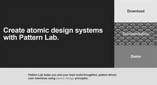
    08. Pattern Lab

    Pattern Lab is based around Atomic Design

    Pattern Lab is a beautiful pattern-driven design tool created by Dave OIsen and Brad Frost. It's based on the concept of Atomic Design, which says that you should break your design down into its smallest parts – atoms – and combine them to form bigger, reusable components – molecules and organisms – that can then be turned into usable templates.

    Although at its core it's a static site generator that stitches together UI components, there's much more to Pattern Lab than that. It's language- and tool-agnostic; it enables you to nest UI patterns inside each other and design with dynamic data; it features device-agnostic viewport resizing tools to help you ensure your design system is fully responsive; and it's fully extensible so you can be sure it'll expand to meet your needs.

    09. Vivaldi

    Sometimes the best tool can be something as simple as a new browser. Vivaldi is a fast, customisable web browser for power-users built by some of the people who started Opera. Dubbed 'a browser for our friends', Vivaldi is built using web technologies: JavaScript and React were used to make the user interface, along with Node.js and lots of NPM modules. 

    Vivaldi is the most customisable browser out there, and it offers other cool features such as command line control, a panel for taking notes, tab stacking and tiling, and web panels that enable you to put all your favourite sites in one place for easy access.

    10. Canva

    Canva is a popular tool for quickly creating social media images and infographics

    Want to mock up something like an infographic quickly and easy? Then Lawrence Harmer, founder of Solve Web Media, recommends Canva.  It's a free, browser-based tools that's used by both designers and non-designers, to make graphics for both print and the web. 

    "Canva is pretty good for making nice images," says Harmer. "Images are the window into the soul of your website and social media, so a tool like this can be key to success." 

    11. Web design proposal tool

    Generate web design proposals easily with this free tool

    Beewits has a nice line in tools to make the business side of web design easier, namely its the Web Design Quotation Generator and Hourly Rate Calculator. Now for 2018, they've brought out another superb free app: the self-explanatory Web Design Proposal Tool. 

    "It's essentially a simple 'Proposify' tool, which allows you to quickly and easily churn out proposals," explains Beewits' David Attard. "It's essentially a glorified form that allows you to enter and change pre-set text, and then creates a Word document ready for sending directly to the client."

    If you sign in to the free service, you can Save your current version, such that next time round, you've got a bunch of fields already filled in with your details. It's simple, but it gets the job done, and what more do you really want? It's not officially been launched yet, as Beewits are currently canvassing feedback, but it's otherwise ready to use.

    12. Site Stacks 

    Check out any website's tech stack quickly and easily

    Here's another browser-based tool that's both simple and brilliant. Type in the URL of any website to this Chrome extension and it lets you look at its tech stack. It's fast, smooth and reliable, provides coverage for over 40,000 products and prides itself on both the accuracy and exhaustiveness of its data. 

    "We built this extension to be a simpler way to access this data," says its makers, "while also protecting your privacy and running all operations on our own servers so that your browsing isn't slowed down."

    13. CodePen Projects 

    A new tool lets you build websites directly inside CodePen

    Founded in 2012 by Alex Vazquez, Tim Sabat and Chris Coyier, CodePen has grown to become of the web's largest and liveliest communities for testing and showcasing HTML, CSS and JavaScript code snippets. For the last five years, it's functioned as both an online code editor and an open-source learning environment, where developers can create code snippets ("pens"), test them and get feedback. 

    Recently CodePen took another big leap forward by launching its own IDE (Integrated Development Environment), CodePen Projects, which lets you build websites within your browser. 

    You can drag and drop your website files, organise them into tabs, and preview your site as you build it. There are templates to help you create sites more quickly if you choose, as well as built-in debugging tools. 

    Note that, although it works in a similar way to the Pen Editor, CodePen Projects doesn't replace the lattter but sits alongside it. You can learn more about CodePen Projects in this blog post.

    14. Bootstrap

    Old favourite Bootstrap has some powerful new updates

    Bootstrap is certainly not a new tool. But the new version of the world's most popular frontend framework is tabbed as 'a major rewrite of almost the entire project' , so I think it warrants a mention. Some notable changes include the following:

    Bootstrap has revolutionised development and there's no doubt the ubiquitous framework will continue to shape how we build stuff on the web.

    15. ally.js

    Don't overlook accessibility - use ally.js

    No list of web development tools would be complete without at least one accessibility tool. Accessibility is one of those often-neglected aspects of design and development, and ally.js can simplify it for you.

    Now a stable product, ally.js is a JS library that gives you fine control over focusable and non-focusable elements. For example, using its API you can prevent elements outside a modal window from receiving focus until the modal is closed. You can also find out exactly which elements are focusable or tabbable, and identify focus changes within the shadow DOM.

    Two other powerful features are the ability to determine in what manner focus has changed (keyboard, mouse, etc.) and when an element is focusable and physically visible on the screen (this can help to avoid page scroll).

    16. Type Nugget

    Type Nugget gives you greater control over your typesets 

    Type Nugget addresses a need you'll have on just about every frontend project: dealing with CSS typography. Still in beta with more features in the works, it's an online typesetting tool that gives you fine control of type styles. 

    The tool displays a diverse set of text samples on the page, which can be live-tweaked in a panel on the right. The panel lets you select font size, weight, style, colour, letter spacing, text decoration and more for individual aspects of the page (global styles, headings, paragraphs, links and HTML lists).

    Usefully, this tool allows you to register for an account, log in and save your progress. After specifying all your settings, you can hit the 'Generate Code' button and Type Nugget will produce a link to a style sheet hosted on its CDN. If you find CSS typography tedious and repetitive, you'll benefit greatly from adding this tool to your workflow.

    17. ARKit 

    Create augmented reality experiences for iOS 11 devices with Apple's ARKit

    Augmented reality – blending digital objects and information with the environment around you - is a space that's generating a lot of excitement in the web and app development community right now. Not least because in June at WWDC17, Apple released ARKit, a new framework that allows you to easily create AR experiences for iPhone and iPad running iOS 11. To get started, simply download iOS 11 and the latest version of Xcode 9, which includes the iOS 11 SDK. Check out what ARKit is capable of.   

    18. Vue.js

    Not used to complex JavaScript libraries? Vue.js is perfect for you

    What would a list of new web tools be without the hottest new JavaScript framework? Vue.js, like React, is a framework for building user interfaces, and utilises a virtual DOM. As the name suggests, Vue's core library is focused on the view layer.

    Look at a code example, taken from Vue's docs, that utilises user input and demonstrates the library's elegance. We'll start with the HTML:

    Notice the custom v-on handler that calls the reverseMessage method. Here's the JavaScript:

    In that example, I'm populating the paragraph with data and defining the reverseMessage method. Vue is great for those less experienced with complex libraries, but also has a number of plugins to help with development of complex single-page web apps.

    19. Hologram 

    This Mac app built on A-Frame lets you create WebVR experiences without needing to code

    Hologram is a new all-in-one tool for WebVR creation. This free desktop app requires no previous coding knowledge, and its native Google Blocks integration enables you to play with lots of free 3D objects right off the bat. Under the hood, Hologram takes full advantage of the power and simplicity of A-Frame, Mozila's WebVR framework. 

    This means that developers can download projects created with Hologram and use them in their A-Frame workflows. It's currently available on Mac and a Windows version is promised soon. 

    20. Parallax SVG Animation Tools

    This set of tools makes it easier to create complex sequences of SVG animation 

    Created by Gareth Battensby of Parallax, SVG Animation Tools is a range of SVG animation tools in the form of a Python script. "I built the tools as a response to the frustrations you get when creating complex or long sequence SVG animations," he says in this explanatory blog post. 

    "The biggest of these being overwritten edits whenever you re-export from Illustrator. These tools completely eliminate that issue – they're perfect for front-end developers who animate SVG graphics with GSAP or similar animation libraries."

    21. GitHub Notifier 

    Get GithHub notifications in your browser with this Chrome add-on

    Hate wading through emails? Prefer the idea of getting GitHub notifications in your browser? This Chrome extension does exactly that. 

    This straightforward but effective tool was created by Stacy Goh and released this September. It enables to get real-time push notifications whenever someone creates an issue, comments on an issue, pushes code, creates a pull request, forks your repository or stars your repository. You can learn more about how and why Goh created it in this blog post.

    22. Quill

    Quill is a flexible rich text editor with a powerful API

    Quill is billed as a WYSIWYG rich text editor 'for the modern web'. There are lots of different contexts in applications where a rich text editor is needed, so it's no wonder Quill has exploded in popularity since its version 1.0 beta release in mid-2016.

    Now a stable product, Quill lets you convert a basic div element into a powerful rich text editor with a few lines of JavaScript:

    But the most powerful features in Quill are its flexibility and extensibility by means of modules and a powerful API. Quill offers themes and modules that include toolbar, keyboard, clipboard and history. You can test-drive many of these features in the Quill playground and of course the documentation is a must-read if you intend to use its advanced features.

    23. URL to PDF 

    Convert HTML into PDFs automatically with this API

    Brought to you by Alvar Carto, this self-hosted API enables you to convert the HTML into PDFs, so it's handy for rendering receipts, invoices, or any other HTML content. The API ignores a page's @media print CSS rules by default, and sets Chrome to emulate @media screen, to make the default PDF look more like the actual site. You can set it to operate automatically at regular intervals and best of all, it's free.
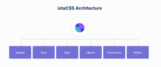
    24. iotaCSS

    iotaCSS is a CSS framework with a difference

    iotaCSS is a CSS framework that's been purposely crafted to be design-agnostic. It was created by consultant frontend architect Dimitris Psaropoulos, who found that other CSS frameworks were imposing a lot of limitations on the designers he worked with. This was forcing him to either write a lot of code on top, or ask the designer to compromise. So instead, he created his own framework, which works a little differently. 

    While most CSS Frameworks behave as a unit, iotaCSS is a set of individual, small and flexible modules that don't depend on each other. You can use one independently or you can combine them to build more complicated user interfaces. 

    iotaCSS been quietly in development for a couple of years, with a number of early adopters using it to build high-scale products. But now it's out of beta and confidently announcing itself to the world. You can learn more about how it works in this blog post.

    25. Launchpad 

    Launchpad turns Sketch into a fully fledged website builder

    Launchpad is a tool from Anima that lets you publish websites directly from Sketch, with no coding required. 

    The entire interface is integrated into Sketch, and can be used to create landing pages and static websites, although at the moment it doesn't support dynamic web pages using JavaScript. But it does let you include links, add responsive breakpoints, set up forms, embed videos and integrate analytics tools. So it could be an ideal tool for setting up a quick and easy promotional website, for example. 

    You can learn more about Launchpad in this blog post.

    26. React Sketch.app

    Airbnb is sharing its bespoke tool with the open source community

    React Sketch.app provides a super-easy way to manage Sketch assets in a large design system. Built by the team at Airbnb to help bridge the gap between designers and engineers, it's basically an open-source library that allows you to write React components that render to Sketch documents. 

    Because React Sketch.app uses Flexbox, its components can have the same rich layout as your real components. That means no more dragging rectangles by hand; everything works like your target layout engine. 

    React Sketch.app, then, makes it simple to fetch and incorporate data into your Sketch files. It also provides an easy way to build your own custom design tools on top of Sketch. You can learn more about how it works in this post.

    27. SVGito

    This free app saves you having to manually edit SVG files

    SVGito is a free web app that cleans up your SVG files, to save you the bother of manually editing them. 

    Created by Peter Nowell, this neat little app automatically optimises your SVGs at the touch of a button, and will typically reduce their size and complexity without changing what they actually look like on screen. 

    You can learn more about SVGito in this blog post.
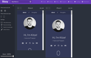
    28. Sizzy 

    Sizzy allows you to preview multiple screens during app testing

    Sizzy is a tool that allows you to preview multiple screens at once while you're testing out your responsive web apps.  

    Creator Kristijan Ristovski had previously been using react-storybook to switch between the different variations of each component. But he got annoyed having to go back and forth between so many devices. So he built Sizzy, which allows you to see all the changes simultaneously, making it much quicker and easier to spot and fix layout bugs. 

    You can learn more about Sizzy in this blog post. 

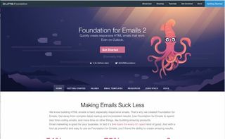
    29. Foundation for Emails 2

    Create responsive HTML emails with Foundation for Emails 2

    Foundation for Emails is a framework from ZURB formerly known as Ink. It is used for creating responsive HTML emails that work on just about every platform and service, bundling together email coding best practices. The latest iteration uses a Sass codebase that gives you access to a settings file, wherein you can define all sorts of defaults to suit your needs.

    As well as the framework itself, ZURB has provided the ZURB Email Stack, an all-in-one workflow that includes:

    The Getting Started guide will help walk you through how to get the stack up and running should you choose to take advantage of all the features.

    30. Form

    With Form, RelativeWave has taken a novel approach

    RelativeWave's Form is a prototyping tool like no other I've tried. It's not a typical design tool in that there's no tools or layers palette. Using the app feels like a mix of design and code.

    While you can't actually create graphics in the app, you can insert them and use what Form calls 'patches' to add gestures and interactions. The Mac app requires you to also use the iOS app so you can view your prototype in real time and interact with it.

    "Form is an app design and prototyping tool with the goal of producing designs that are closer to what you get in production," explains RelativeWave creative coder Max Weisel. "We want designers to work directly on the production side of an app, and at the same time free up engineers to focus on more complex problems."

    There are some great tutorials on how to use Form, but the process is rather complex if, like me, you are used to creating visuals in Photoshop. Moving an image to the centre of your device, for example, is achieved using Superview variables and Match Patches. Once in place you use maths to divide the width and height and connect them to the X and Y positions in Image View. Group those together, rename the variables and adjust the X and Y anchor points. I found this process fairly complex.

    However, once you get your head around the processes, you can create stunning prototypes. Having access to the device's camera and other sensors means the prototypes you create are just as powerful as the coded app would be.

    Related articles:


    Source: 30 web design tools to speed up your workflow in 2018