Pages

Friday, June 30, 2017

10 Wireframing Tools to Help you Create Great Websites, and Make Great Design Decisions

Wireframing tools 2017As a web designer or developer, you're probably familiar with wireframes and their place in the design process.

Wireframes are skeleton structures used to plan the design direction, and functional elements, of a new website or application. Think of them as a project's blueprint — one that both you and your client can use to ensure you're working towards a common goal.

Remember: Web designers and developers should always use wireframes as an ideation tool to get buy-in from clients for their creative concepts before they start actively building functional prototypes. ðŸ˜‰

Though wireframes can be as simple as a doodle on a napkin, or as extensive as a high-fidelity digital mockup, freelancers and agencies alike should consider using a wireframing tool — one that allows them to consistently produce professional wireframes, work collaboratively as a team, and impress clients.

Freelancers and agencies alike should consider using a wireframing tool — one that allows them to consistently produce professional wireframes, work collaboratively as a team, and impress clients.

In no particular order, here are 10 wireframing tools to consider for your next web design project.

1. Wireframe.cc Wireframing tools 2017: Wireframe ccWireframing tool #1: Wireframe.cc.

Wireframe.cc is one the of the most basic wireframing tools web designers and developers can employ in their design workflows. But with a simple interface and small feature set, users can focus on the task at hand — creating effective wireframes.

Wireframe.cc's WYSIWYG interface and web-based solution allows users to immediately start designing wireframes without the creation of an account. It's the perfect solution for beginners to start digitizing their paper wireframe designs.

TL;DR

Perfect for: Designers and developers looking to access their wireframes anytime, anywhere.

Operating systems supported: All — Wireframe.cc is web-based.

General support: Wireframe.cc Docs.

Cost: Wireframe.cc offers a basic account for free. However, to create private wireframes, embed clickable elements, and maintain everything in a personal account, Wireframe.cc starts at $15 per month, per user.

2. Mockflow Wireframing tools 2017: MockflowWireframing tool #2: Mockflow.

Mockflow is another great solution for web designers and developers looking to add a wireframing tool to their design workflow, but who may not be familiar with the intricacies of a more robust solution.

To make projects even more simple, Mockflow has a store filled with third-party templates that users can browse through — and purchase mockup/wireframe templates from — if they're looking for inspiration.

TL;DR

Perfect for: Designers and developers looking to quickly integrate their wireframing tools with Slack and/or Trello.

Operating systems supported: Mockflow is available as both a Mac OS and Windows app.

General support: Mockflow Help Center.

Cost: Mockflow offers a free, basic plan, and starts at $14 per month, billed annually. At this plan level, freelancers and agencies can have up to five users on a project, house unlimited projects, and have access to the Mac OS/Windows desktop applications.

3. Axure Wireframing tools 2017: Axure
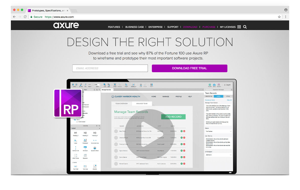
Wireframing tool #3: Axure.

If you're looking for a wireframing tool with robust features and functionalities, look no further than Axure. An intermediate-to-advanced level solution for web designers and developers, Axure is data-driven and allows for users to completely validate ideas prior to writing, or implementing, any code.

With the ability to include conditional flows, animations, dynamic content, and other tools once wireframes are ready to become prototypes, Axure allows freelancers and agencies to control all aspects of their product design — from start to finish.

TL;DR

Perfect for: Web designers and developers looking for a more robust wireframing tool.

Operating systems supported: Mockflow is available on both Mac OS and Windows.

General support: Axure training and support.

Cost: Axure is only available as a paid solution, costing $29 per user, per month, or $495 to license outright. At this subscription level, users have the ability to sketch and create wireframes, design flow diagrams, and more.

4. InVision Wireframing tools 2017: InVisionWireframing tool #4: InVision.

InVision is one of the most widely known prototyping and wireframing tools in the industry. It's used by businesses of all sizes, and puts an emphasis on creating environments prime for collaboration — resulting in exceptional products and designs.

InVision integrates with both Slack and Trello, and is great for web designers and developers looking for a solution that will support wireframing, as well as the advanced functionality needed to create beautiful prototypes.

TL;DR

Perfect for: Web designers and developers looking to collaborate and bring their wireframes to life.

Operating systems supported: All — InVision is web-based.

General support: InVision Help Center.

Cost: Invision, and its robust wireframing and prototyping tools, is forever free. Only Enterprise clients are required to pay a monthly fee to use Invision's services.

You might also like: Creative Uses of InVision for Your Next Project.

5. MockPlus Wireframing tools 2017: MockPlusWireframing tool #5: MockPlus.

MockPlus advertises itself as being the faster wireframing and prototyping tool. Faster design, faster interactions, and faster testing.

To support its claim, MockPlus has a variety of features that let web designers and developers create wireframes more quickly than if they used traditional, readily-available tools, like Sketch and/or InDesign. These features include a WYSIWYG editor, pre-designed components, markup components, master documents, QR codes for device testing, and more.

TL;DR

Perfect for: Web designers and developers looking for an easy-to-use wireframing tool to start designing mockups and prototypes.

Operating systems supported: Mockplus is available for Mac OS, Windows, Android, and iOS.

General support: Mockplus support // Mockplus community.

Cost: Mockplus is available on a subscription basis for $129 per user, per year. Or, users can purchase an unlimited perpetual license for $399. Mockplus is also available for free — however, users lose the functionality to export their wireframes as images or HTML, to work on team projects, etc.

6. Moqups Wireframing tools 2017: MoqupsWireframing tool #6: Moqups.

Moqups is a vibrant wireframing tool that brings a crisp design aesthetic to every concept, workflow, or process created using the platform. Moving from lo-fi to hi-fi, Moqups provides the functionality needed to work through a project from the flow charts of project planning to interactivity and the realism of prototyping.

Moqups incorporates real-time feedback features, cloud-based storage, and unlimited users under a single monthly subscription — making it ideal for freelancers working with other freelancers, or smaller agencies looking to formalize their wireframing process.

TL;DR

Perfect for: Web designers and developers looking for a wireframing tool that accommodates a larger team on a smaller budget.

Operating systems supported: All — Moqups is completely web-based.

General support: Contact Moqups' support.

Cost: For 10 projects, 1 GB of storage, and unlimited users, Moqups is $13 per month. However, for $29 a month, users can unlock unlimited projects and 20GB of storage — perfect for bigger teams.

You might also like: 5 of the Best Prototyping Tools to Test Out Your Web and Mobile Designs.

7. Balsamiq Wireframing tools 2017: Balsamiq
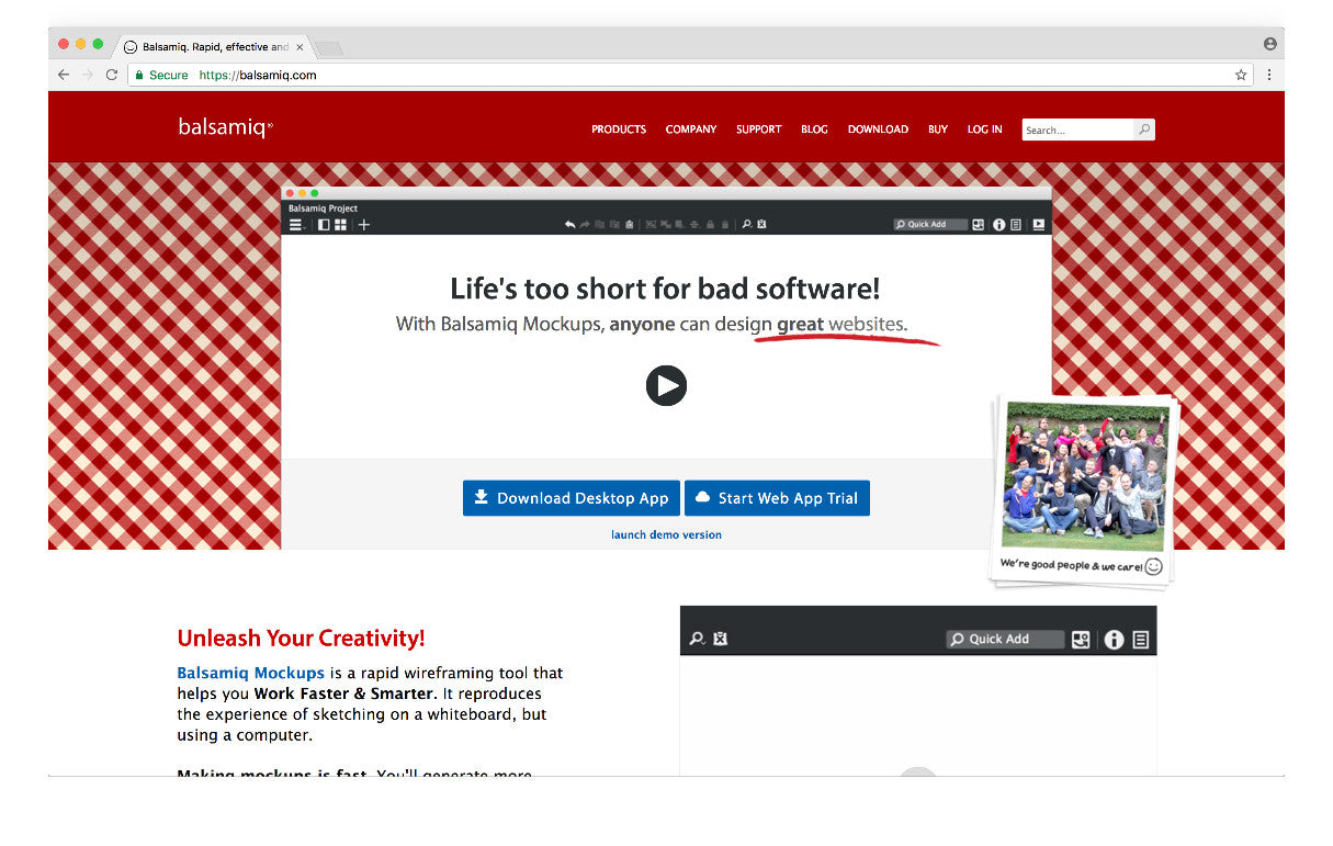
Wireframing tool #7: Balsamiq.

Balsamiq prides itself on allowing web designers and developers to create low-fidelity wireframes, putting the focus on concepts and making them the driving force for honest client feedback. The thinking behind this wireframing tool's methodology is simple: honest feedback means better product design decisions, which leads to happier end users.

Balsamiq is a great solution for freelancers and agencies looking to tell stories with their mockups, rather than design fully-functional prototypes. Balsamiq offers limited interactivity, a strong storyboarding focus, the ability to collaborate with team members, and share final thoughts for feedback with stakeholders.

TL;DR

Perfect for: Web designers and developers looking for a wireframing tool that focuses clients on productive discussions, rather than pretty designs.

Operating systems supported: All — Balsamiq is available both as a web app, and a desktop software for Mac OS/Windows.

General support: Balsamiq support.

Cost: Users can purchase the desktop version of Balsamiq for $89 flat, or purchase a subscription to Balsamiq's web-based service for $12 a month.

8. SimpleDiagrams Wireframing tools 2017: SimpleDiagramsWireframing tool #8: SimpleDiagrams.

Unlike the other tools presented in this list, SimpleDiagrams brings a fun, sketching element to the wireframing process — and is an appealing tool for designers and developers alike who want to add some flair to their proposed approach to problem solving, process development, etc.

SimpleDiagrams comes with over 500 pre-drawn shapes, a large background library, and some examples of the many ways you can use this wireframing tool to bring ideas and concepts to life. Though not a robust solution for web designers and developers, especially with the lack of collaboration functionalities, SimpleDiagrams is a great tool to share ideas internally — and provides a great starting point to build professional wireframes for stakeholders using another tool.

TL;DR

Perfect for: Web designers and developers looking for a tool that allows them to quickly, and creatively, express their concepts and ideas.

Operating systems supported: SimpleDiagrams is available for both Mac OS and Windows.

General support: SimpleDiagrams' support.

Cost: Users can purchase a single-use license, valid for up to three devices, that costs a one-time fee of $49.

9. HotGloo Wireframing tools 2017: HotGlooWireframing tool #9: HotGloo.

HotGloo is a web-based wireframing tool that enables web designers and developers to collaborate anytime, anywhere — with a completely optimized mobile interface for freelancers and agencies who often find themselves out-of-office, or on-the-move.

HotGloo comes with a variety of features that users may find attractive; for instance, HotGloo is built completely in HTML, which allows users to quickly export and implement their wireframes and prototypes in HTML, as well. HotGloo also has over 2,000 UI elements to incorporate into wireframes, and allows users to quickly change viewports to see how these elements and designs will look on desktop, mobile, etc.

This wireframing tool is a good option for designers and developers who have a fundamental understanding of product design and wireframing concepts, and who are looking for a solution that allows them to quickly formalize ideas for stakeholders with out-of-the-box assets.

TL;DR

Perfect for: Designers and developers looking for a wireframing tool with out-of-the-box UI elements and icons.

Operating systems supported: All — HotGloo is completely web-based.

General support: HotGloo's Help Center.

Cost: HotGloo's most popular subscription, Team, allows for up to 10 users, six projects, and unlimited reviewers for $27 a month.

You might also like: The Benefits of Using a UI Kit.

10. MockingBot Wireframing tools 2017: MockingBotWireframing tool #10: MockingBot.

MockingBot is a wireframing tool created for fast-moving developers looking to quickly bring their concepts to life. Specializing in mobile app development, MockingBot allows users to drag-and-drop content blocks, transitions, and images into the mockup — building stakeholder-ready wireframes in under 10 minutes.

Though not a feature-rich or robust tool for frequent, dynamic wireframing and prototyping, MockingBot has enough functionality for budding web designers and developers to increase their product design and concept rendering skills.

TL;DR

Perfect for: Designers and developers looking for a wireframing tool specifically for apps.

Operating systems supported: MockingBot is available as a desktop application for Mac OS, Windows, and Unbuntu — as well as a plugin for Sketch, Android, and iOS.

General support: MockingBot forums.

Cost: MockingBot offers a free, basic plan. Pricing is based on number of collaborators, starting at $10 per month, for five collaborators.

You might also like: Building for Developer Success with Shopify's Newest APIs.

Choose what works best for you

When it comes to conceptualizing your ideas and bringing them to life, we could suggest an infinite amount of wireframing tools — but only you can decide which one offers the most value for your business.

Most of the above wireframing tools have a free trial, or even a free account, available to all users. So go on and try them out! 🙂

Have a favorite wireframing tool? Or see one you couldn't live without missing from the list? Let us know in the comments below.


Source: 10 Wireframing Tools to Help you Create Great Websites, and Make Great Design Decisions

Thursday, June 29, 2017

Html5 product designer tool

Home

Creating a brand image is a crucial task. There are times when your customers are starting their business from scratch and have no idea how to commence with the designing. A good letterhead design software will provide suggestions with designs and templates according to the type of business so that they can get an idea about the type of logos, colours and templates that are compatible to their business.


Source: Html5 product designer tool

Wednesday, June 28, 2017

Five Practices for Better Web Development

By Anthony Dang, Senior Developer at The Cogworks

In this article, we discuss some common issues that plague web development and the best practices to address these issues.

1. Think before you code

Many developers "Code First" before thinking. Solutions that are not planned will typically end up:

  • Tightly coupled
  • Hard to understand
  • Hard to maintain
  • With more bugs
  • With too much code
  • As developers, we should THINK about the architecture of what we are trying to make; we don't start building a house without drawing a plan first. The people who draw these plans actually know what they're doing. They're called Architects!

    The best thinking tool you can use is a Unit Test (see next point).

    2. Write unit tests at the start

    "A software system can best be designed if the testing is interlaced with the designing instead of being used after the design" – Excerpt from Report of The Nato Software Engineering Conference (1968)

    Many developers think that unit tests can be written at the end. However, what many developers find is that their code is not unit testable. So we can't just write tests for our code, we have to write code that is testable!

    When we gather requirements from a stakeholder, we write down the acceptance criteria. The acceptance criteria is the test. This is Behaviour Driven Development!

    How many of us like to spend our time in the debugger?

    With Behaviour/Test Driven Development, we will spend less time debugging, and more time coding. The most amazing thing about Behaviour Driven Development is that good architecture is a coincidental by-product of our unit tests. So, unit tests can actually help you write better structured code!

    Related to this, there are some developers who believe that unit testing takes too long, and that it eats into valuable development time. This really shows that they haven't learned how to do unit testing properly and likely do not fully appreciate the value of unit testing.

    Automating tests for the behaviour of your application will save time in the long run. It's like learning to play the piano. It will take you years to become an expert and you will be practising for the rest of your life, but it's totally worth it, and enjoyable!

    Our typical test suite involves NUnit, Moq and Ghost Inspector. For frontend testing, there's Karma and Jasmine.

    3. Performance profile your code!

    It's hard to find developers who actually performance profile their code. For some reason, people tend to think that a slow website can be fixed with an external solution such as Varnish, CloudFront etc. I don't know who told them this, but please stop! It typically means that you don't understand your application.

    I've seen situations where random cache times were used in multiple layers to cover up performance problems. Needless to say, the applications tend to have random instability and unpredictable performance.

    So please, run a performance profiler to see where your hotspots are! You may find that you only need to cache a couple of simple services. You should always implement "Intelligent Caching" over "Blanket Caching".

    The performance profiling tool we use is ANTS Performance Profiler, by Redgate.

    4. Load test your website

    How many users can your website handle and what is the typical server response time? Many developers cannot answer this question, but it's something that you should be able to tell the client/stakeholder without even blinking.

    A website we recently inherited was running so poorly that it could only handle 15 users, with 30 seconds server response time. We load tested the website so we had a baseline to compare to. With a little refactoring and some minimal caching, it was purring along at 7000 users per minute, and sub-200ms.

    So, when you're building a website or improving one, you should know:

  • How much traffic will the website have?
  • How much traffic do you want it to handle?
  • What is an acceptable server response time? Google says 200ms is good!
  • What the Google Analytics traffic is like (eg. high traffic pages)?
  • Our go-to for load testing is loader.io.

    5. Keep your stakeholders informed

    "There's nothing clients appreciate more than deception, and being kept in the dark"

    – Said no one, ever! But for some reason, many agencies act this way.

    I have seen so many agencies who create a functional document, build for 12 weeks, deliver late, then demo something that is not fit for purpose – it does not fit the client's needs. The client then has to pay even more money because they are already too far down the rabbit hole to back out of the project.

    A better approach is to concentrate on completing features that you can demo to the client – and then demo often (and religiously)! This will give you valuable feedback early in the process, whilst also prompting valuable discussions about the functionality. The client will be informed throughout the process and any issues will be identified very early. One great side effect of this is that you will be gaining trust.

    Some best practices are:

  • Demo weekly / at the end of each sprint
  • Be transparent about blockers and issues
  • Tell the client about the things that have run slower (or faster) than expected
  • Give weekly budget reports
  • In some cases our clients even join the project standups
  • Biography

    Anthony has worked with .NET since 2007. He is active in the open source community, in particular the Umbraco CMS, and is a regular presenter at conferences and tech meetups. He lives and breathes automation and development processes, and is a proponent of Behaviour/Test Driven Development. Originally from Sydney, Australia, he is now based in London, working at The Cogworks as part of a development team spanning 5 locations and 3 countries.

    The Cogworks is a leading UK digital agency, specialising in Umbraco. The company is active in the open source community and regularly releases open source software. They also run developer training events and conferences, of which the most famous are the Umbraco UK Festival and Umbraco Poland Festival.


    Source: Five Practices for Better Web Development

    Tuesday, June 27, 2017

    BGO Software Launches Website Redesign for Better Client Experience

    Sofia, Bulgaria (June 27, 2017) – BGO Software announced the release of the latest redesigned version of its site, www.bgosoftware.com . Key features of the enhanced website include user-friendly, cleaner, more appealing and contemporary look and feel. To improve navigation through all pages and to make user experience more engaging, there are now drop-down sections with an upgraded list of services and solutions."Our mission as an innovative IT company is to clarify not only our vision and ideas through our website but to provide loyal and future clients with the professional testimony they are looking for." Said Ivailo Ivanov, Chief Technology Officer. "That's why we showcased our projects and products in the form of case studies. With the launch of the refreshed website we focused not only on what we do, but also how we do it, what technologies we use and what development methodologies we implement."Clients can now more easily find the information they need as there are dedicated sections to each software project we have developed and worked on through the years. The simplified and revamped design is further complemented with well-structured content and optimization for all browsers and devices. The intelligent use of media queries and flexible tools resulted in a responsive and highly intuitive layout that enables visitors to better interact with BGO Software online."As changes in the IT business and industry occurred, it was just a matter of time to respond to them with a redesign that best stipulates who are we, what motivates us and how we change our society not only through a number of projects but through our corporate social responsibility too." Said Ivan Lekushev, Chief Executive Officer. "For this reason, we enriched our new website with dedicated pages about our charity events, sports initiatives and education projects."

    BGO Software has been a recognized leader in the IT sector in Bulgaria and the world since its establishm ent in 2008. Headquartered in Sofia, Bulgaria, the company has completed advanced software projects for leading organizations within major industries, including IT, Logistics, Healthcare, Pharmaceutical and Clinical Research, Construction Engineering and others. Currently, BGO Software is Microsoft Gold Partner, Progress Premier Partner, Business Partner of Hoffmann-La Roche and Official Government Supplier for the Health Research Authority of the Department of Health in the UK.

    BGO Software159 Tzar Boris III blvd., fl. 10,1618 Sofia, BulgariaTel: +359-884-678-299Email: info@bgosoftware.com

    This release was published on openPR.


    Source: BGO Software Launches Website Redesign for Better Client Experience

    Monday, June 26, 2017

    3 Free Graphic Design Editors that Might Actually Change Your Life

    Where can I find free online graphic design software? Why do I need online graphic design software if I'm already a designer?

    If you design daily for clients, you may think free graphic design programs are a waste. After all, why use websites when you could use high-tech software? However, having a variety of tools in your toolbelt is actually a boon, especially as you find yourself working on highly specific projects with quick turnarounds.

    For instance, if your client just has to have an image of a snowboarder or an illustration of a film reel, it can be helpful to have software to assist you. Otherwise, you may spend a lot of time creating or searching for elements you could easily find via editing programs.

    And it turns out the right image is important. In fact, studies show that visual content performs 4.4 times better on social media than plain text, and higher quality images have a positive impact on engagement.

    So, whether you're a professional designer or new to the game, today we're outlining a few online editors that will make your life easier.

    free online social media generator Crello

    If you don't know Depositphotos, they are a great stock image tool, as well as leaders in the visual content sphere. They also recently launched Crello, a visual editor that provides users with the ability to create vibrant, professional-grade designs (whether the user is a designer or not).

    In fact, Crello is perfect for both experienced designers and newbies; professionals can create mock-ups and starting points, while newcomers have the ability to create a product, start to finish. This is a great program for people looking to up their social media presence.

    Is Crello affordable?

    We like free stuff, and Crello offers free editing. What's more, you can find thousands of free images, like photos, icons, vectors, and more. If you do have some money to spend, paid features won't break the bank. Paid features cost up to $0.99 each, and the use of images is unlimited. This means if you do pay for an image, you're investing in something you can continue to use.

    Is Crello time-efficient?

    Time-efficiency is the name of the game in the design world, especially for freelancers. Because you can create a design in your browser (without signing up), you can quickly put together a great product in a fraction of the time it would take to make something from scratch. Plus, Crello comes with an easy starter kit. You'll get a collection of 6,000+ free templates, 10,000+ design elements, and millions of stock high-res photos.

    Additional Details

    Crello has additional features, including proper dimensions (29 formats with preset sizes), options to upload personal images and fonts, visual effects and filters, and multiple use licensing. (Purchased premium elements remain available for reuse.)

    Crello is part of Depositphotos, a commercial platform with licensed stock photos, graphics, vectors, and videos. Depositphotos works to bring authors and buyers together so they can mutually benefit. You can find 65 million stock photos, illustrations, vectors, and video content on DP.

    Edit vectors online for free Vecteezy Editor

    You may be familiar with Eezy, a company that offers stock resources to creatives. Their brand, Vecteezy, released the Vecteezy Editor this year. The Vecteezy Editor is formatted very similarly to Adobe Illustrator, and it allows users to create designs from scratch. Additionally, visitors can edit premade vectors from the Vecteezy platform.

    This program targets design newcomers with its intuitive system and simple menu. However, the editor can also be a great resource for designers. For example, if you need a specific element for your illustration, you can simply search Vecteezy's library for that element, edit the file to your needs, then download as an .svg, .jpeg, or .png file.

    Is the Vecteezy Editor Affordable?

    Definitely. Vecteezy and the Vecteezy Editor are free to use. (Remember, we like free stuff.) You can easily edit and/or download vectors, icons, brushes, PSDs, and more. The Vecteezy newsletter includes free vectors several times a month to browse and use, too. The part we like most about Vecteezy, however, is the community; with a free account, you can create a profile page and comment on images. If you're interested in a purchasable option, you can sign up for Vecteezy's paid service, with which you'll get Premium resources, royalty-free usage, and unlimited downloads. Go here to see the pricing options currently available.

    Is the Vecteezy Editor time-efficient?

    While it depends on your needs, the Vecteezy Editor is an efficient option for those who are new to Adobe Illustrator. High-level programs can be extremely overwhelming (and even discouraging) for budding designers, and the Vecteezy Editor can assist in bridging that gap. Plus, with millions of graphics available, ready-to-go images within the editor, and the ability to download edited files in a variety of formats, you have a number of immediate options.

    Additional Details

    The Vecteezy Editor has a Background Tool, Pen Tool, Text Tool, and an Elements Tool. If you're looking to add gradients, text, or images, you can easily do so. Plus, the elements tool has custom shapes and illustrations.

    Vecteezy and the Vecteezy Editor are branches of Eezy, which boasts other resource brands, such as Brusheezy, Themezy, and Videezy. Available content includes brushes, website themes, templates, and videos. Creatives worldwide contribute to Eezy brands, providing artists with stock resources for their projects.

    Do graphic design online free Canva

    Canva is a program that allows users to create graphics for a number of projects, including album covers, photo collages, social media, presentations, and more. Whereas Crello and the Vecteezy Editor are a great fit for both designers and newbies, Canva is best-suited for those without design experience.

    With tutorials, inspiration guides, and more, Canva is a great tool for marketing and in-house projects. Canva began as a way to teach students graphic design basics. Now, Canva helps users worldwide put together unique images.

    Is Canva affordable?

    If you're a one-person operation (or even a ten-person operation), Canva is free forever. With their free plan, you receive two organizational folders, 1GB of storage, a library of templates, and the ability to upload your own images. However, keep in mind that Canva's photo collection offers photos for $1 each. If you have more than 11 members in a team, Canva offers pricing tiers. Go here to see what they are.

    Is Canva time-efficient?

    Canva is designed to be user-intuitive, meaning you can immediately login and start your specific project. Because you can choose the type of design you're doing (e.g. album cover, poster, etc.), you save time on formatting. Additionally, Canva offers an app for iPhone and iPad, meaning you can design on the go. Plus, Canva has a huge variety of layouts and backgrounds available for your designs.

    Additional Details

    Canva comes with photo editing tools, font tools, design courses, teaching materials, and more. If you're interested in forming a community, Canva allows you to share your work and see work from others, too. Canva is a great resource for those in marketing, as well as those trying to promote a social media presence. The company also offers extensive support for users both free and paid.

    Conclusion

    You may be a seasoned designer or someone who is still learning the ropes; either way, it's good to have a few options when you're working on a project. Crello, Vecteezy Editor, and Canva are all great resources for illustrations, newsletters, and social media. You may find one works best for one project, while another is your everyday go-to. Either way, it's good to play around and see what works for you.

    Have more online editors you love? Tell us in the comments below!


    Source: 3 Free Graphic Design Editors that Might Actually Change Your Life

    Sunday, June 25, 2017

    Cognitive Loading in UX Design

    I am writing this blog to make readers aware of how "Cognitive Loading" impacts UX designing and what software engineering needs to take account while developing their products.

    If your new to UX designing I would recommend you read my blog (User Experience (UX) Design) in my blog space. Cognitive Loading  term can be traced back to "Cognitive Load Theory" which was developed by John Sweller and he has published a paper on the subject in journal Cognitive Science in 1988. "Cognitive load" relates to amount of information that a person's working memory can hold at any one point in time. To understand this definition better we need to understand how human beings process information. The diagram below shows this information cycle:

    Information Processing

    The Long-Term Memory can store almost infinite amount of information and each time your recall an information a neural path is created sometimes information can have errors or corrupted in someway but its still reliable enough to keep us functioning. The Working Memory is where Cognitive loading take place and primary reason being it can keep track of on an average only 7 plus or minus 2 information at any point in time, with training it can increase a little, but stress and other emotional factor can interfere with it. The Long-Term memory encodes information based on how many hooks it has to it and some amount of repetition is required to store and multiple sensory information provide additional hooks to store required information for example smell is one of sensory input that can get strongly encoded along with information so certain smell can invoke strong memory recalls.

    Sweller in his paper mentions about three types of Cognitive Load intrinsic, germane, and extraneous, each one is explained below:

  • Intrinsic load is related to integral complexity of an idea or set of concepts. For example, in programming world, learning to program in scripting language is much easier than doing it with OOPS language.
  • Extraneous load is due to design of instructional materials to learn a new concept or to process and idea. Inefficient instructional designs adds to unnecessary load. For example, an audio-visual presentation format usually has lower load than a text format because  working memory has less information to process and more hooks to recall.
  • Germane load relates to degree of effort involved in processing, construction and automation of schemas. Germane load is sometimes also associated with motivation and interest.
  • Intrinsic load is unchangeable, whereas the instructional designer can manipulate extraneous and germane load. In UX designing we will have to balance between extraneous and germane load although users of of our product may not be learning a new idea or concept reducing their cognitive load will make our software easy to use.  The topics discussed here will be more concentrated on reducing extraneous load. So you can think of cognitive load as giant resistor that stops users from achieving there goals and less resistance that our product generates better UX will be delivered to them.

    Engineering Explanation For Congnitive Load

    We as software developers and consumers have at some point in life seen a UI like the one shown in image below:

    BulkRenameUtility

    Its a nightmare scenario where if you have to update one piece of information you need to scan though the whole UI. Even though its partly grouped users still have to scan his eyes to find relevant information. The technique discussed below can be applied to software product to reduce their cognitive load.

    Recognition over Recall

    To retrieve information effortlessly from Long-Term Memory we need external sensory stimuli like a familiar text, sound or smell (Recognition) in absence of stimuli it takes extra effort (Cognitive Load) to recall the information.

    The Recognition over Recall methodology is a powerful technique and one of the reasons why people like a Graphical User Interface (GUI) over a Command Line Interface (CLI).  The GUI provides menus, option selections, buttons and many other ways to use your product once user has seen your product he can recognize it from past experience and choose appropriate action he wants to take, whereas in command he needs to recall all options he need to use and there is no assistance available to him. A GUI can also show a workflow and what step user currently is doing and how many more to go, these are very helpful in reducing Cognitive Loading.

    Just by using a GUI your software product does not reduce Cognitive Load you need to organize your User Interface(UI) in such a way that its easier to for users to reach their goals. The developers understanding of business domain plays very crucial role as it will lead to effective workflow design and showing appropriate information on screen when user expects to see it or might need it. For example providing Intellisense assist feature for programmer or providing similar features whenever you can to user can greatly reduce your users workload, with Machine Learning become easier to implement day by day, any kind of advanced assistance provide by your product easily increases its appeal.

    RecognitionOverRecall

    Progressive Disclosure

    This becomes a very important Cognitive Load reduction technique when your product needs to display lot of information to end users. For example e-commerce website like amazon uses Progressive Disclosure very effectively amazon sells millions of products to end users and they effectively categorize the product their retailers want to sell and as user search for it progressively discloses product catalog reducing burden on users.  You will never find amazon listing everything on their home page.

    This technique requires your software to be like an intelligence agency where agents on assignment are given information on need to know basis. The more effective your chain of disclosure more effective your software product is. Again I would stress that knowing your products users or domain of your target customers will provide an effective way to implement Progressive Disclosure, remember that users can only work with max of 7 things on screen at a time keeping this number lower makes user more effective and he feels productive while using your software.

    ProgessiveDisclosure

    Highlighting

    This Highlighting technique is used grab user attention to a portion of screen,  the choosing of color for highlighting must be carefully done so it grabs users attention but does not hurt his eyes if he keeps staring it at for longer time. Highlighting must be used sparingly and only in case of critical error or changes are happening and chances of user will miss to notice it on screen. Over using this causes user to shut it out and you may not be able to get users attention. Most modern UI avoid highlighting as much as possible unless its really required usually secondary highlighting technique are used like changing color or make red or yellow asterisk(*) or any other way of giving feedback is used to report change in status. They key to effectively use this is to be consistent and use the same highlighter for similar severity or operation.Highlighting

    Mapping

    This is the easiest to identify but can be hardest to implement in software product. The idea of mapping is to represent a real world object as it is or model it in a way that its easy to understand and relate. For example in olden days the control panel of industrial machinery had knobs, switches, toggle switches, levers and analog meters now with advent of computer controls product developers try to keep them as its to make it easy for human operators to use and understand. Another example I can give is shown below we have gas stove with 4 burners, if controllers of burners are arranged as shown in right side image its easier for users to understand and not make mistake of turning the wrong one on\off.

    Stovemapping

    As mentioned early try to achieve mapping in software product may be hard at times like mimicking a knob lever or analog meter may be hard is time consuming for developers when computers can show them as numbers and user can manipulate the numbers easily, but whenever mapping is done right it makes very good UX and sometimes require less help information or affordance needs to be displayed on screen for user to interact.

    Affordance and Entry Point

    An affordance  is possibility of an action on an object or environment, for example we all know how to hold a cup, the handle of cup acts like an affordance does not require any explanation.

    Affordance_Coffee_Cup

    Similarly in software product it should be easier to identify the affordance like what is a label, what is text field, what is a button. If a new affordance is introduced it should be used as per its original intent and in consistent way. Even though this sounds very dumb many developers trying make their software look cool sometimes mess it up, I have seen websites where I cannot differentiate between a label and text box or a hyperlink and a underlined text. Use affordance consistently in once screen if it looks like button other screen it looks like clickable label it will frustrate users. I have seen cases where developers tries to fool people like having a large close button with text and 'X' mark in ad popups, you will be able to close ad only if click 'X' mark this is not a good practice and users will feel that they are deceived.

    An Entry point  is a marker or hint on how to begin using an object or start a process. When the UI has two many objects to interact with if its not straight away evident what user need to do then we need to drop a hint or marker like start here this is know as an Entry Point. A need for entry point can be easily identified by showing UI to new user who has not seen it previously and if he feels stuck or need to think for a length of time to determine what he needs to do next. If your UI is very workflow oriented then this may not be required as user knows where he is and how to get to his end goal.

    Entry_Point

    Constraints

    Every user problem a software product is trying to solve will have rules and constraints its the job of software to make sure user does not enter anything invalid or perform an action in wrong order or ahead of time before all inputs are provided. Some of the rules may be enforced by management like licence terms to avoid miss use of software and also make sure user pays fee to use software.

    How you enforce these rules in your product will matter on how UI looks and behaves when constraints are violated or conveys it to user. The ideal scenario is to have "Poka yoke" mechanism enforced. Poka Yoke means "mistake-proofing"  in Japanese and was applied by Shigeo Shingo  in 1960s to industrial processes designed to prevent human errors. Many of our day to day products that we use Poka yoke for example an electric socket you will never make a mistake while connecting an electric plug to a socket, sometimes I feel this should have been taken a step further and sync with the switch on\off position so user does not plug or unplug the socket when switch is on position to prevent an arcing.

    In case of software product ensure all user inputs are validated never assume that user never makes a mistake or he is smart most user are in hurry or under pressure to meet a deadline and can make lot of mistakes while working and even a simple error made by user may take a long time to recover if your business process is complex and if a crucial validation is missing in processing logic. Other important way to enforce is to ensure UI screen flows as per constraints and enable\disable or hide\unhide controls as required but ensure they errors and exception conditions are properly handled you do not want a button to be permanently disabled because of bug in your code. The last way to enforce is to make sure you include forgiveness in your product where user can make mistake and recover them quickly as soon as he realizes it.Constraints

    Feedback

    This is very important especially if your working with application that work on slow network or time consuming process. The idea behind Feedback is to acknowledge every user input action this leads to better UX as users know that your application is not stuck and doing the operation its suppose to do. The best example for this I can give is the Like button on Facebook app if you hit it multiple time it will acknowledge even though there is no network connectivity and will temporarily queue it and retries to complete it later and if it does not work it asks user to retry.

    Feedback will reduce user frustration a lot, they will like your product. Please make sure if your operation involves unreliable infrastructure like network operation, time consuming database operation or File system operation try to give an effective feedback to user as to what your software is doing and give option to cancel whenever possible and retry again a responsive software is considered better than a non responsive ones even though user may be waiting for same amount of time for an operation to complete.

    Feedback.jpg

    Confirmation of Action

    This is not a technique, whenever user does an action that cannot be recovered or is irreversible then its standard practice to show confirmation of his action with a dialog. The image below shows such a conformation dialog which windows show when your about to elevate the permission of a program.

    ConfirmationOfAction

    The Conformation of Action is required but must be used sparingly over use of this will lead to user unconsciously accepting confirmation. One of the best practice I see in this area is giving user a setting to whether he needs see confirmation dialog.  This allows user to choose which actions he want confirmation before executing and for which he does not want. Another good practice is to adopt forgiveness technique wherever possible but this requires additional coding but is worth the effort.

    Forgiveness

    This technique involves making all operation in your software as reversible operations with an option to become permanent at some check point or after confirmation from user. This is used in many of the modern software products they provide soft delete options with time limit or undo user actions. This allows users to make mistakes and recover from them easily. Implementing Forgiveness means writing lot of additional code and having bigger memory footprint, but it pays off in terms of UX.

    Forgivness

    Further Reading

    The mantra to reduce Cognitive Load of users is "Don't Make me Think" as mentioned by Steve King  and title of book he authored.  If your user has to think hard at any point or get stuck while using your product then you have failed.  You can read the below two books to further enhance your knowledge on reducing Cognitive Load and enhance UX.

  • Don't Make me Think – Steve Krug
  • Rocket Surgery Made Easy – Steve Krug

  • Source: Cognitive Loading in UX Design

    Saturday, June 24, 2017

    10 Website Redesign Tips for Better Results in 2017

    Having a website for your small business is never easy—even if your website is small and simple. Once in a while, you'll need to update your website's design to make sure it looks great and helps you grow your business.

    In a series of tutorials about redesigning your small business website, we've showed you the following:

    As you're planning your redesign, it's not just important to go through the above steps. You should also know the features and functionality your website needs to stay updated. This is especially true of features that could make or break your sales and the growth of your business. 

    Are you ready to redesign your website with the best tips and techniquesAre you ready to redesign your website using the best tips and techniques? (graphic source)

    This guide can serve as a checklist of the must-have features that can help your new website design bring in the business results you're aiming for in 2017. Let's dig into these killer website redesign tips.

    Best Website Redesign Tips for Growing Your Business (In 2017)

    The following items are essential if you want to make sure that your target audience finds your website and converts into paying customers:

    1. Think "Mobile First"

    As we've covered in the first tutorial in this series, websites need to be designed with mobile users in mind. This is important for two reasons: usability and search. 

    In 2016, mobile browsing overtook desktop browsing, according to research from StatCounter, a web monitoring firm. This means that it's now more likely that your visitors will be mobile users instead of desktop users. If your site isn't mobile-friendly, then you might lose out on a large number of leads. 

    Google has also started applying "mobile-first indexing."  which means that the mobile-friendliness of your site will soon become a factor in how far it appears in search results. This could mean that a competitor's site might appear higher than yours in some search results if your site isn't mobile-friendly.

    Once your redesign is ready, you can run it by Google's Mobile-Friendly Test to see how well it works on mobile devices. If your website doesn't pass the test, the results will also list the changes you need to make if you want to pass.

    2. Plan for Growing Your Content

    Another helpful website redesign tip is to plan further ahead for growth. Even if you think having a static five-page website is enough for your current needs, your redesign should allow for scaling up your content as you grow. This will make your design easy to adapt should you decide to have a blog or to increase your product pages within the next two years.

    If you're working with templates for redesign, this could mean using a site template that works with WordPress or, if you're running an eCommerce site, you could use an eCommerce template that works with the platform you're choice. 

    Browse through more top WordPress themes: 

  • WordPress

    Top 20+ Premium WordPress Themes (Most Popular For 2017)

    Brenda Barron

  • 3. Have a Seamless User Experience

    When redesigning your website, it's easy to get lost in the technical details, such as which content management system you'll use, the features you need, and how to integrate your site with your other marketing channels. But you might forget who you're designing the site for in the first place: Your target customers.

    This is where UX (user experience) design comes in. UX design prioritzes how your intended users experience the site. This includes convenience, ease of use, and any positive feelings associated with interacting with your company through your website. To learn more about this approach, refer to the following helpful guides:

  • UX

    What is UX Design?

    Joanna Ngai

  • UX

    The Five Core Components of UX

    Joanna Ngai

  • While focusing on UX can help you create a new design that caters to your customers' habits and needs, it's not enough to claim your redesign a success. You also need to align it with aesthetics, functionality, and business results. 

    4. Make Split Testing Easy

    Split testing will allow you to incrementally improve the results you'll get from your redesign. Basically, split tests allow you to conduct experiments on your website so you could make changes that improve your conversions, sales, or other metrics. If you've never conducted split tests on your site before, your new design could be the best opportunity to start. 

    Split tests are especially crucial for eCommerce businesses. Websites that bring in leads or have any kind of call-to-action can benefit from split tests as well.

    To get started, you can check out tools like Optimizely, Unbounce, and Visual Website Optimizer.

    5. Have Strong Visual Elements and Graphics

    More than just designing website elements such as logos, icons, and background graphics, a redesign needs to bring forward a stronger visual presence for your business. This includes stunning product photos, video, and other visual content like infographics and memes.

    This is because people tend to respond strong visual elements. Eye-tracking studies from the Nielsen Norman Group found that some images catch more attention than others. For example, using real photos of your customers and employees will engage customers more than a photo that looks like a stock image. 

    Detailed product photos also attract more attention than generic ones. In the example below, users spent more time looking at the detailed photos of Pottery Barn products rather than Amazon's generic thumbnails.

    Photo web content eye tracking studyPhoto web content eye tracking study.

    Visual elements may also bring more visitors to your site. Buzzumo, a company that provides content research tools, found that articles with an image every 75 to 100 words had twice more social shares than articles with fewer images. Also, if you repurpose your site's images for your social media marketing, this leads to higher engagement from your followers.

    6. Set Up Dedicated Landing Pages

    Landing pages are pages on your website that are dedicated to providing a single offer and call-to-action. Because landing pages are so specific, they're an effective way to test and measure different offers, marketing messages, and even designs. 

    When you're conducting these tests, you don't even have to make dramatic changes to your homepage or overall website, since you'll only test individual landing pages.

    Depending on the industry, dedicated landing pages can have an average conversion rate ranging from 2.6-percent to 6-percent, according to a report from Unbounce, a popular landing page platform. To learn more about making high-performing landing pages and how they can boost your sales, check out the following resources:

  • Landing Pages

    What Is a Landing Page?

    Brad Smith

  • Landing Pages

    10 Best Bootstrap Landing Page Templates—With Responsive Designs

    Sean Hodge

  • 7. Integrate Your Social Media Presence

    As we mentioned in the previous guide in this series, optimizing your site for social media is one of the steps you need to take before you launch your new design. This is because at least a third of your referral traffic is likely to come from social media sites. 

    Here are some signs that can help you determine if your redesign is fully integrated with your social media accounts:

  • Correct Social Snippets. All of your pages should look good when shared on social media. This means that the right thumbnail images, headlines, and descriptions appear when you share a link from your site. 
  • Branding Compatibility. When people visit your redesigned website from social media and vice-versa, they should not be surprised by any change in branding or visuals. Make sure your colors, images, logo, and other visual elements are consistent all throughout your site and your social media accounts.
  • Prominent Social Media Links. Your visitors should easily be able to go to your social media pages from your website. That way, they don't have to search for the right account to follow. Your social media links don't have to be the focus of your redesign, but they should at least be easily accessible from any page. A corner of the site footer,  header, or sidebar works well.
  • Efficient Workflow. If you'll be running a blog, there has to be a simple, automated way for you to share your most recent blog posts via social media. You can use social media management tools to make this easier.
  • 8. Pay Attention to Personalization

    The most common approach to a redesign is to serve the exact same pages to all your users. But this lets you miss out on the benefits of personalization and segmentation. 

    First, personalization gives customers what they want. A survey from Infosys found that 74-percent of customers are frustrated when their experiences aren't personalized. Additionally, more than half believe that personalization affects their purchasing decisions.

    Personalization can even grow your business. In fact, by 2020, personalization can increase business profits by 15-percent, according to Gartner, a research firm.

    Just because you're serving your website in a personalized way, it doesn't mean you should give each individual user a unique experience.

    In the example below, Trunk Club has separate customer journeys for men and women. After you select a path, the images, marketing messages, and offers you receive are specific to the chosen gender.

    Trunk Club segmentation for women and menTrunk Club personalization for women and men.

    Your personalization approach doesn't have to be complicated, highly technical, or expensive. You can start by creating separate landing pages per referral source, per major location, or per target demographic. 

    9. Keep SEO in Mind in Your Redesign

    The search engine optimization (SEO) strategy of your new design will affect how easily your target audience can find your site using a search engine like Google or Bing. This is another important website redesign tip to pay attention to. SEO is especially important for eCommerce sites, since search is still their number one source of referral traffic, according to Yotpo, a review software company.

    Traffic by source

    But SEO strategies in 2017 might not be the same as the ones that were effective when you launched your last website design. Here are the things you need to work on if you want an updated SEO strategy:

    Mobile Search Indexing

    We've already mentioned Google's "mobile-first indexing" earlier in this guide, but it bears repeating here since it should be part of your SEO strategy.

    To ensure that your new design gets indexed by Google properly, make sure to get a responsive design. This type of design adapts to the device viewing it. You can request a responsive design from your designer. But if you're going the DIY route, you can look at designs like Porto and Canvas from ThemeForest .

    Local Search

    Just because your website is accessible all over the globe, it doesn't mean that you can ignore local customers. Even in an era where sites like Amazon can send you anything from appliances to food, local search is still becoming more relevant. According to Clix Marketing, 72-percent of consumers who did local searches visited a store within 5 miles. 

    As you're getting ready to launch your redesign, make sure that there are some local markers such as listing your business address, using your city/locality as a keyword, and getting links from locally relevant sites.

    Voice Search

    According to Google, voice searches make up around 20-percent of searches via its mobile app. While voice search still represents a minority of searches, you need to start planning for it.

    Start by incorporating more natural phrases or questions into your SEO keyword strategy. For example, if you are a dog trainer in Dallas, you can use phrases like "where are the dog trainers in Dallas" or "find a dog trainer in Dallas." To find the phrases you can use, ask yourself: What phrases would a person say out loud when describing your business? What questions would they ask when looking for a business like yours? 

    10. Ensure Your New Site Fits Your Brand

    Finally, your redesign should fit your brand in two ways: Look and feel. 

    The "look" is the design's visual characteristics. Are the colors the same as the ones on your logo and other marketing materials? Does your new design use the same photos as your other materials when depicting your product, office, or personnel? 

    "Feel," on the other hand, is the user's experience of the website. This includes things like ease of use, performance, and the overall feeling users get when they arrive on the site. If you're promoting your business as a small town shop that creates handmade goods, you don't want your site to feel like a large chain store. 

    For example, Walmart has a site design that highlights the wide variety of products they have, the hundreds of customer reviews per product, and also emphasizes discounts and lower prices.

    Wallmart highlights its large volume of productsWallmart highlights its large volume of products.

    On the other hand, a smaller, more specialized online store like Harry's feels different. The product photos are larger, since they're highlighting the details of the few products they have. They also do more artistic shots of their products rather than just put them up against a white background.

    Harrys highlights product qualityHarry's highlights product quality.

    Neither approach is right or wrong. It's all about the visual and experiential choices that represent your brand most accurately. Learn more about developing your brand values: 

  • Branding

    How to Define Your Core Brand Values (And Why You Should)

    Julia Melymbrose

  • Making the Most Out of Your Website Redesign

    While you needn't complete all the website redesign tips above, the more items you've checked off your list, the better the results you'll get. As long as you ensure that your site works great on mobile, provides the best user experience, and has enough room for growth and changes, then your redesign can last you through 2017 and beyond.


    Source: 10 Website Redesign Tips for Better Results in 2017

    Friday, June 23, 2017

    API design guidelines – best practices for building a user-friendly API

    I've seen my fair share of poorly designed APIs – and I'm not alone in experiencing poorly built or clunky API's that add dead weight to an application. Unfortunately, those who built the offending API didn't follow API design guidelines and have made life harder for fellow developers.

    A robust API will enable users (our fellow developers) to integrate and strengthen software, and if it's not built robustly you risk the integrity of not only your own application but the software you are integrating it with.  

    So what makes a robust API? In this guide, I'll walk through a couple of core concepts to consider. These concepts are applicable to all types of APIs, regardless of language or type. 

    Why are APIs so fragile in the first place? How to not break your API

    An API's purpose is to allow developers to create software to access and interact with your application. This is software-software interaction and allows programs to communicate. As soon as you change your API, the client (machine) will not know how to automatically adapt.

    APi design guidelines - don't break your API!

    So, if you change your API without considering the implications, your user's integrated software breaks. Backward compatibility is key in API changes as many applications will be using the old calls and simply changing them will stop those applications from working correctly.

    So before you change anything, think of the impact this could have on your applications, or applications integrating with your API.

    API design guidelines

    It's your responsibility to create an API that follows good practices. You can't specifically control what users do, but you should be able to implement guidelines for using your API the best way. There are a few ways you can do this.

    Great documentation prevents guesswork for your users

    Often, the API isn't used to its full potential. I've actually seen API documentation that is a direct dump of an SQL database table. Not very helpful when the description of a field is describing the type, i.e. "Character string. Variable length" when the fieldname is "ParentId". I'd much rather know what the parent is.

    Good documentation lets your users know what each call does, and how to do the best/most with as little calls as possible.

    There are, admittedly, many users that are happy to have a play and having great naming conventions can lead to intuitive self-discovery. However, they should not replace documentation. These require a level of knowledge of your application and the API which you can't assume all users will have.

    And let's not forget the reduction in support costs from repeat questions!

    The API needs to make sense for the context

    The terms "chatty" and "chunky" are used to describe an API's state and are terms coined by Jonathan Hawkins and Emmanuel Schanzer of Microsoft to describe an efficient 3-tier application design (web with to/from connections to legacy systems). So I'll use their definitions here so you can decide the context.

    Chatty API

    API's allow developers to call certain services which are to complete common tasks.

    Many APIs still don't have this capability.

    Some APIs require you to have to do multiple calls to perform a single operation. This leads to a "Chatty API".

    "A chatty API is any API that requirements me to do more than a single call to perform a single, common function."

    Reece

    Why are chatty APIs a bad thing? Well for one, it's harder to develop for since common calls that should be combined are needed to be called individually. So what happens if only some of these are called?

    For example, imagine an API built for creating events. When creating the event, you call POST /events and supply the event name. But then you need to call /events/{id}/location where you now specify the location at which the event will be located. Lastly, you call /events/{id}/owner  where you set the owner of the event.

    Wouldn't it be easier to be able to do this all in one call?

    Another reason why chatty APIs are considered poor quality is because requiring multiple network calls will slow down an application.

    This is because each call contains data overhead (i.e. sender information, headers, authentication) which will slow down an application as well as network latency per each request. Caching can help but doesn't solve the problem of unneeded requests.

    Chunky API

    A chunky API is the opposite, where it includes more information in the payloads and does more with single calls.

    A chunky API will create are fewer calls, but can do more, or return more information. Which is better for your application. Of course, there are limits to how chunky it should be, but the general concept is to include all information that makes sense for the higher level service.

    This follows the concept that the API offers services for actions rather than simply access to low-level objects.

    SDKs and integrations

    APIs are basically their own little language that communicates with your system to get certain common tasks done, which is why I've included this section as an important part of these API design guidelines.

    Raygun's API design guidelines consider integrations as pivotal

    A good practice for API design is to offer an SDK or integration to your API for a given language. This isn't vital to success, but it definitely helps the developers working on calling the API as it also abstracts the business logic away from the client's application and ensures that it's used in the way that was intended by the API design.

    As an example, here at Raygun, we are very lightweight and have integrations built for many different languages to help customers use raygun in the right way. This not only provides an easy way to integrate with Raygun's API, it also guides users to use the higher level calls and not worry about low-level data objects.

    Here is an example of how to access Raygun's API in an ASP.NET application within the error handler in the Global.asax file: 

    protected void Application_Error() { var exception = Server.GetLastError(); new RaygunClient().Send(exception); } protected void Application_Error()   var exception = Server.GetLastError();   new RaygunClient().Send(exception); Clear status codes

    Using correct error codes is extremely valuable to the user of your API, and beneficial to your development team. If you are thinking "but there are over 70 codes! Do I have to use them all?", the good news is most of them are quite ambiguous – so you don't need them.

    (I'm looking at you 418 I'm a teapot.)

    Best practices tell us that we shouldn't assume people know the context of errors messages, as they may toggle between apps and see your error message days after the incident. Be generous with the information you share so users can make sense of it.

    When you have to check the payload for errors instead of being able to rely on the status code, you can waste so much time figuring out what is going on. Errors directly in the payload can break applications that are using this payload.

    Example

    Status code 200 OK returns, but within the payload, there are lists of errors or an error message. If it used the status code instead (i.e. 500 internal server error), the user would parse the payload differently. This is essential for developers so they can easily handle situations where they have no control over.

    400 Bad Request indicates that the request is incorrect and needs to change. 403 Forbidden indicates that the request is not within the scope of the application's authentication. Each of these codes represents a different situation and helps tremendously for debugging.

    try { var response = (HttpWebResponse) request.GetResponse (); } catch (WebException e) { switch (((HttpWebResponse) e.Response).StatusCode) { case HttpStatusCode.NotFound: // code to handle 404 here break; case HttpStatusCode.ServiceUnavailable: // code to handle 503 here break; } }  var response = (HttpWebResponse) request.GetResponse (); } catch (WebException e) {  switch (((HttpWebResponse) e.Response).StatusCode) {    case HttpStatusCode.NotFound:      // code to handle 404 here    case HttpStatusCode.ServiceUnavailable:      // code to handle 503 here

    Aim for consistency in your error messages, as it's not as common as you think, and APIs are rarely as you need them to be!

    API design guidelines: considerations for the build process

    A few questions that can help gain clarity on your API project are:

    What is the slowest part of an API?

    The network time (i.e. report generator will probably be the computation of the report instead of network time).

    What will the user want?

    An API is a service, not an object. So the API should do more than return a DB object.

    (Here is where the great documentation we discussed earlier will help your users a lot.) Send as little data as possible, but not less. Don't bloat your responses with information unrelated to tasks associated with those calls.

    Users want consistency and calls that do as expected. No surprises!

    Which information should I group?

    If multiple calls are always in conjunction, it's good practice to bundle them up (this will hinder the users that don't do multiple calls, so only if it makes sense). Grouping protocol is up to you – at the end of the day, your API should be used to do common tasks.

    Are you ready to build better APIs?

    The main purpose of an API is for the users to be able to successfully complete common actions with ease and with as little calls as possible.

    If they need to make five calls to simply create a user, then something isn't quite right. If they get back giant payloads of worthless information, it's quite possible that these payloads should be split up for different tasks.

    If users spend a lot of time trying to debug errors through the payloads, then the requests need to be updated to return appropriate error codes. This saves developer time as they will know what's gone wrong, rather than trying to debug an issue which is present on the API server rather on the client.

    APIs deal with low-level information/objects but should give high-level access for developers to use.

    Don't forget, better APIs make fellow developer's lives easier!

    Now read

    Ebook: Do you have a strong process around JavaScript errors? Download the ultimate to JavaScript Error Monitoring here

    Did you know Raygun's best features are available out of the box? Check out how Crash Reporting compliments deployment tracking here.

    Next level software intelligence across your entire stack. Get deeper analysis into how your applications are really performing. Learn more.
    Source: API design guidelines – best practices for building a user-friendly API

    Thursday, June 22, 2017

    A Designer's Guide to Getting Started with Web Development

    Designers and developers are sketched as individuals from two different planets but they are expected to work very closely at any contemporary web development job. They need to deal with new thoughts continuously and back them up in the several stages of product development procedure.

    Let us consider a designer's viewpoint for a while. It is indeed a challenging task for them to successfully collaborate with developers. For a successful job completion, these designers need to work their technical skills and build an easy relationship with developers. Let us discuss why designers need to bring in more technical expertise for collaborating with developers and how they can achieve the end-result efficiently.

    Fundamentals of Digital Layout

    As a designer, you may or may not have knowledge in a programming language. Learning the fundamentals of CSS and HTML can be an easy pursuit if the whole process is linked with web design. Every designer should really complete the following two courses to grasp the fundamentals of page layout.

    The first course is HTML and CSS which includes an estimated time of seven hours. It provides you with the concept of basic page makeup, positioning, layout and the box model. You will be required to complete some sample projects. The second one is making a website which involves an estimated time of three hours. It will help you make a recent version of any website. You need just ten hours to get the basics. By investing, even a small, amount of time, you will come to know how your designs will be implemented.

    Connect with a Developer

    Pair programming is the key. It is an idea of software development and involves teaming up with developers. Besides the benefits of inclusion, it is a good way to transfer knowledge and also enhance team understanding. Often the developer and designer do not have not have a common understanding of the problems they encounter daily and how to handle them strategically. It is recommended to spend an hour sitting with a developer and explain the process to get a clear perception of the task. If you can perform this regularly on a project, it will help you to get actively engaged in it.

    Select a Text Editor and Get Familiar with It

    The text editor is the place where developers spend lots of time. A designer should select a decent text editor and get comfortable with its use. Some typical text editors are there to make comprehensive CSS or HTML. It is the leading choice for fast prototyping among the high-quality designers. If you are not comfortable with your prototype, use it for a better experience.

    A good text editor plays an important role to enhance workflow. Two editors are particularly well-matched for the designers. The first one is WebStorm. If you want to provide more time to deal with HTML, JavaScript and CSS files, WebStorm has everything you require to perform common tasks. It will also help you fine-tune your workflow. The second one is Sublime Text. This cross-platform text editor looks good and includes lots of functions to help you perform front end coding. While working as a front-end designer, you must work with developers or may need to perform small code changes yourself.

    Learn a Programming Language

    Working with a developer will help you get a basic understanding of at least one programming language. The effort will go a long way towards effective collaboration. We recommended that you choose JavaScript. Read on to learn more about its three major plus points. JavaScript is known as the most popular programming language in the world. It is recommended that you grasp the basic concept, functionality and other features of the language.

    JavaScript is very powerful for interactions in design. This language is popular for interactivity and online animation. If you want to design interactive pages compared to text-based and static pages, JavaScript plays an important role for this. The future of WordPress is strongly based on JavaScript. It is recommended to start learning the language to make living designs for the platform. A newbie can handle the language even with a fuzzy familiarity of the syntax. The concepts can be easily grasped, unlike other popular languages such as PHP, Python etc.

    Make and Use a Style Guide

    If you work with developers, two things will be obvious for you; process orientation and detailing. Developers need appropriate documentation. These are the descriptions many designers can learn from and it is suggested to introduce them in your project by using style guides. Sometimes pattern libraries are useful. Style guides are known as documented design components that are used throughout a project.

    You can find some examples of style guides from MailChimp and WordPress Themes. If you want to get a complete theory, sites like Pattern Lab and UI Patterns are also useful. When you work with developers, the advantage of this approach is huge. Discipline, professionalism, and thoroughness are added into your process from which designers can benefit.

    Realize Version Control

    Version control is one of the favorite subjects of the developers. It can get overwhelming for someone from a non-technical background. Designers struggle to handle assets, track changes in spite of attempts to use programs such as LayerVault and Adobe's Version Cue. That does not happen in the development world.

    Introduction to Git for Web Designers will provide you with an easy introduction to the subject. Git for Designers is also important. An interactive Git Tutorial is also a good way to practice fundamentals of Gits in an easy and understandable interface. By learning the fundamentals of version control, simple changes can be completed to these files and improve the overall workflow.

    Wrapping Up

    In this era, even small teams can produce software products that are used to solve problems of millions of individuals. In this environment, your design options may be limited due to lack of technical skill. Designers who are capable of efficiently collaborating with developers will be able to open the doors to rewarding projects and lots of development in the future. All you need to do is accompany a developer to the workplace and set the ball rolling.

    About the Author

    Catherrine Garcia is a freelance blogger and web developer. She is currently working as a freelance writer at MarkupTrend and managing content. You can follow her on Twitter.


    Source: A Designer's Guide to Getting Started with Web Development

    Wednesday, June 21, 2017

    Most Developers Fail to Design Websites Accessible to People With Disabilities

    /image/MTYwODQz.jpeg

    The Internet makes a seemingly unlimited variety of products, services, and timely information available at our fingertips wherever we are. But it might not be that easy to take advantage of those offerings if you have a disability.

    Although many countries have website accessibility standards in place, the majority of developers fail to adhere to them. For example, as of last year 70 percent of U.K. websites—where about 12 million people have disabilities—did not meet accessibility standards outlined by the country's Equality Act of 2010. Consequences can include lawsuits by advocacy groups.

    IEEE Member Preety Kumar has made Web accessibility her life's work. In 1999 she founded Deque Systems, a company in Herndon, Va., that provides software and training to help developers ensure their websites are accessible.

    The company's software can detect whether colors are too similar—which might make navigating a website difficult for people who are color-blind. The software also includes suggestions on adding alt tags, which can be read aloud to a user with visual impairments by screen-reading devices. Kumar gave a keynote speech at this year's CSUN Assistive Technologies Conference, in San Diego, which The Institute attended.

    We asked her about the benefits of prioritizing accessibility from the start of development, and how programmers can get up to speed.

    What are some of the biggest mistakes developers make when it comes to making websites accessible?

    Simply a lack of awareness of accessible development. Developers learn only if they are told about the errors as they make them.

    For example, if you don't add a label to a certain field on a website, a screen reader won't read the associated text to an input field. This leaves users guessing as to what they are filling out, such as name or email address. That's why it's important to integrate accessibility into testing, early and throughout the life cycle of development.

    My company encourages clients to think of a proactive plan for building accessibility features into their sites from the onset. This saves time and money and makes the product more user-friendly for those with disabilities.

    Are those training to become Web developers being taught about accessibility, and where can they receive instruction?

    I don't believe accessibility is a part of most college curriculums or training programs. Often developers choose to learn how to do something when it is relevant and in-demand. Web accessibility is no exception.

    Deque University, which is part of Deque Systems, is an option for learning about accessibility design. The school offers self-paced online classes, instructor-led workshops, and other resources.

    Another resource is the Teach Access initiative, which was started by large technology companies to teach Web developers about accessible design and development.

    Finally, once they receive training on website accessibility, they can pursue a certificate from the International Association of Accessibility Professionals.

    What costs are involved in making a website accessible?

    If a company is building the website in-house, factoring in accessibility won't really add much time or cost to the budget. There will be some upfront investment, such as specialized development tools, establishing a work flow, and training developers. After that it shouldn't account for more than 2 percent of the total budget for the project.

    Who else can benefit from accessible websites?

    While accessibility is geared toward people with disabilities, it is amazing how an accessible website is essential for elderly users. Prioritizing accessibility is equally valuable for many developing countries, where reliable bandwidth is a real issue and pages are much slower to load.

    Are more companies making accessibility a priority?

    My company is getting more requests from Fortune 500 companies, U.S. federal agencies, financial institutions, health-care providers, retailers, and education providers, and many more.


    Source: Most Developers Fail to Design Websites Accessible to People With Disabilities

    Tuesday, June 20, 2017

    Group test: what's the best web-design software?

    PC Advisor reviews the best web design software packages you can use. The best web design tools you can use

    By PC Advisor staff | 04 Apr 2012

    PC Advisor reviews the best web design software packages you can use.

    2. Serif WebPlus Starter Edition Serif WebPlus Starter Edition

    As you'd expect from a simple-to-use and free program, there are limitations to Serif WebPlus Starter Edition, but it's ideal for beginners. Just bear in mind that if you are new to web design, you'll have to think of hosting and purchasing a domain name.

    Read our Serif WebPlus Starter Edition review.

    3. Artisteer 3 Artisteer 3

    As long as your content follows a traditional blog layout, Artisteer allows for an impressive degree of customization and lets you go into the details only as much as you want to.

    Read our Artisteer 3 review.

    4. XSite Pro 2.5 XSite Pro 2.5

    So to answer my own question: If you are a non-technical user and you feel that affiliate marketing is a good way to make money online, XSite Pro will make it possible for you to test your marketing prowess with a minimum amount of technical fiddling. Your websites will not win any design awards, but they might convert users into paying customers and net you affiliate fees.

    Read our XSite Pro 2.5 review.

    5. Weebly Weebly

    If you're looking to get a website up and running quickly and don't want it to look too off-the-shelf, you may want to take Weebly for a spin.

    Read our Weebly review.

    Tags: Share this article Comments
    Source: Group test: what's the best web-design software?